adobe-fonts / adobe-fonts/source-han-sans
[Low priority] The curved hook stroke (撇鈎) might need improvements.
- Ngôn ngữ chính
- Python
- Star
- 17.2k
- Fork
- 1.4k
- Chỉ số merge pull request
- Không có pull request nào được merge trong 30 ngày
Mô tả
I apologize if my terminology for font editing may not be correct.
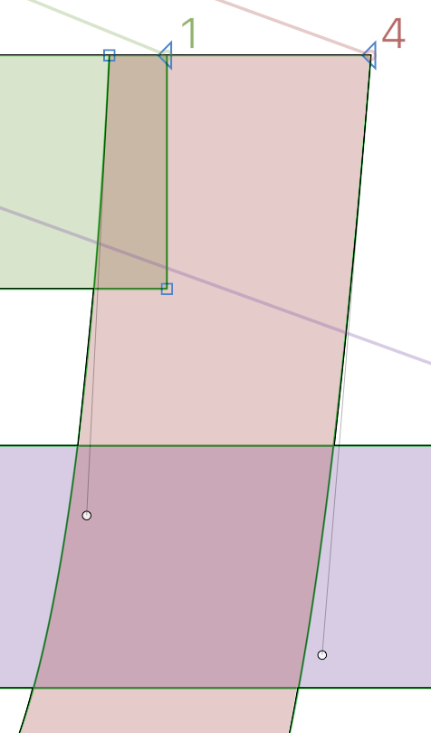
While the end result is not obvious, looking in the font software (Glyphs, for example), I see some minor kinks at the start of the curved-hook stroke (撇鈎), and only happens when looked at extremely close.
There is also another very minor issue with the left side also inconsistently having either a sharp (blue square) or smooth point (green circle), and that there is also two points put very close to each other (probably as a support node?), but that's not the main point as they are normally hidden. Perhaps I would like the idea of cleaner shapes, so that's why I point it out.
Unfortunately, virtually every character that incorporates the curved-hook stroke (撇鈎) has the flaw, for example, 馬, 每, 与, 曷, 方 and a lot more, across all locales, which means tens of thousands of glyphs and a lot of laborious work if this is to be improved. Therefore I am also putting this issue as "low priority" in the title, and I do not expect this to be addressed, even for the long term. (**EDIT:** 也 is not affected)
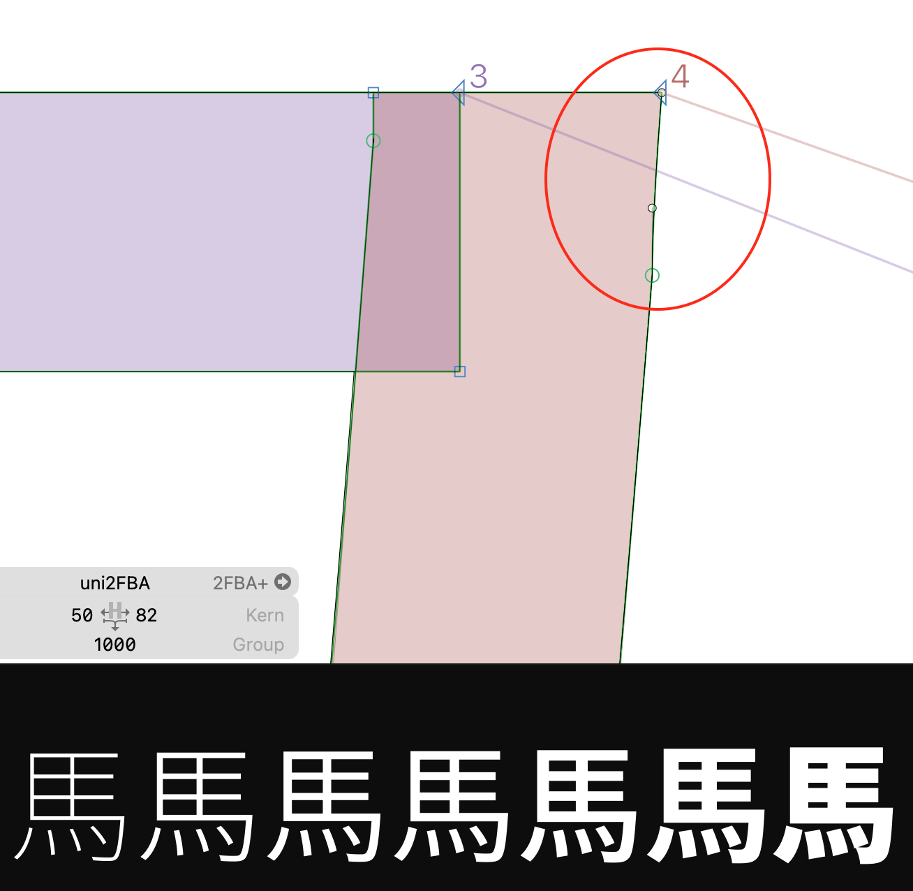
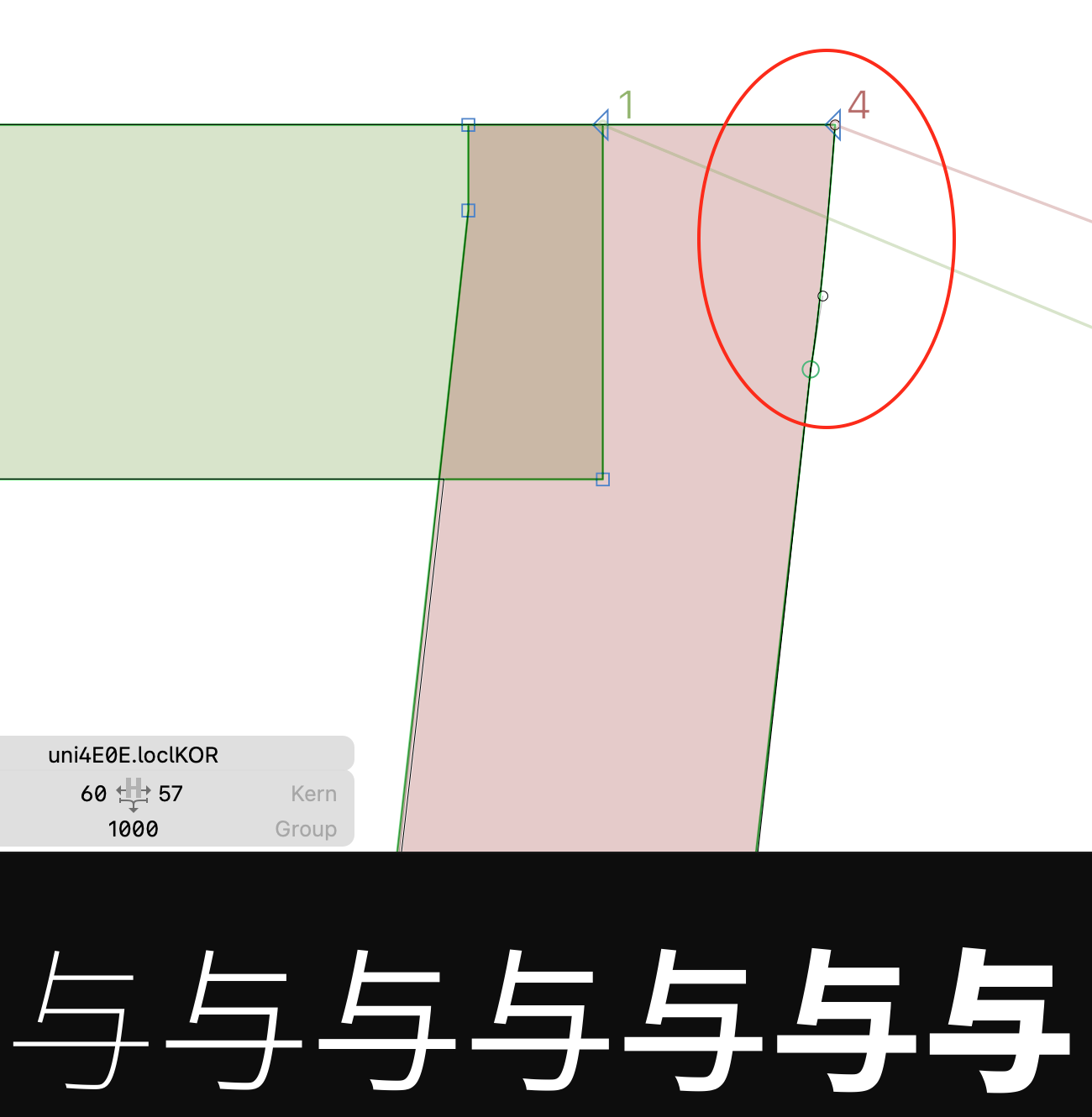
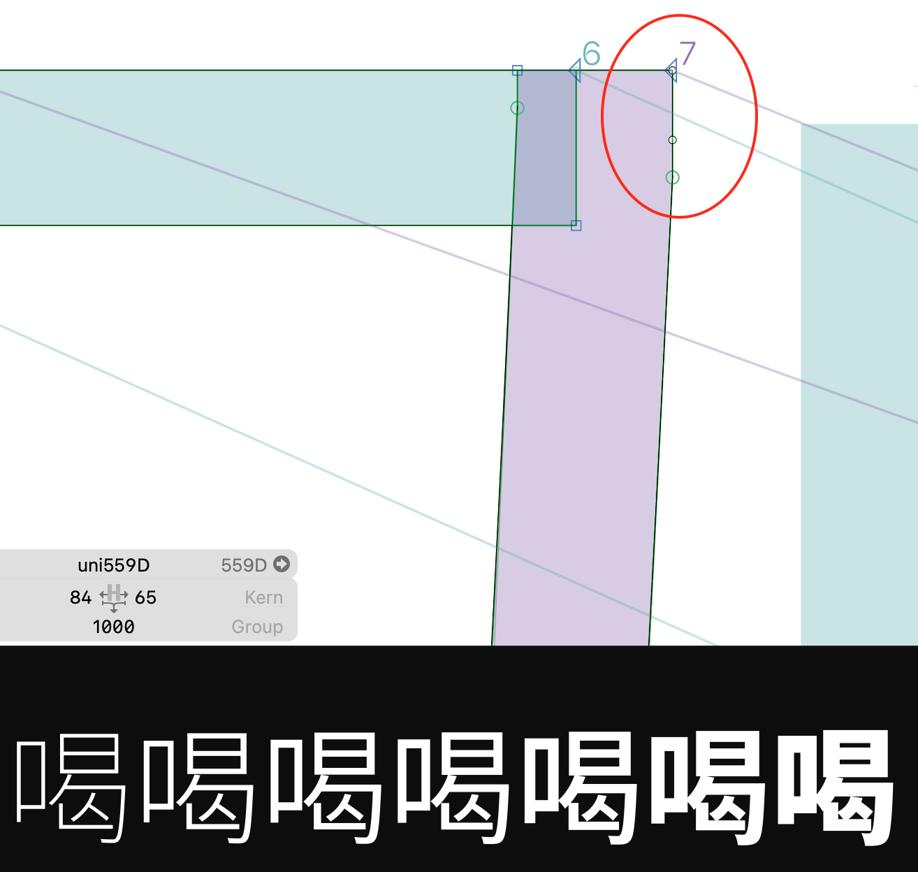
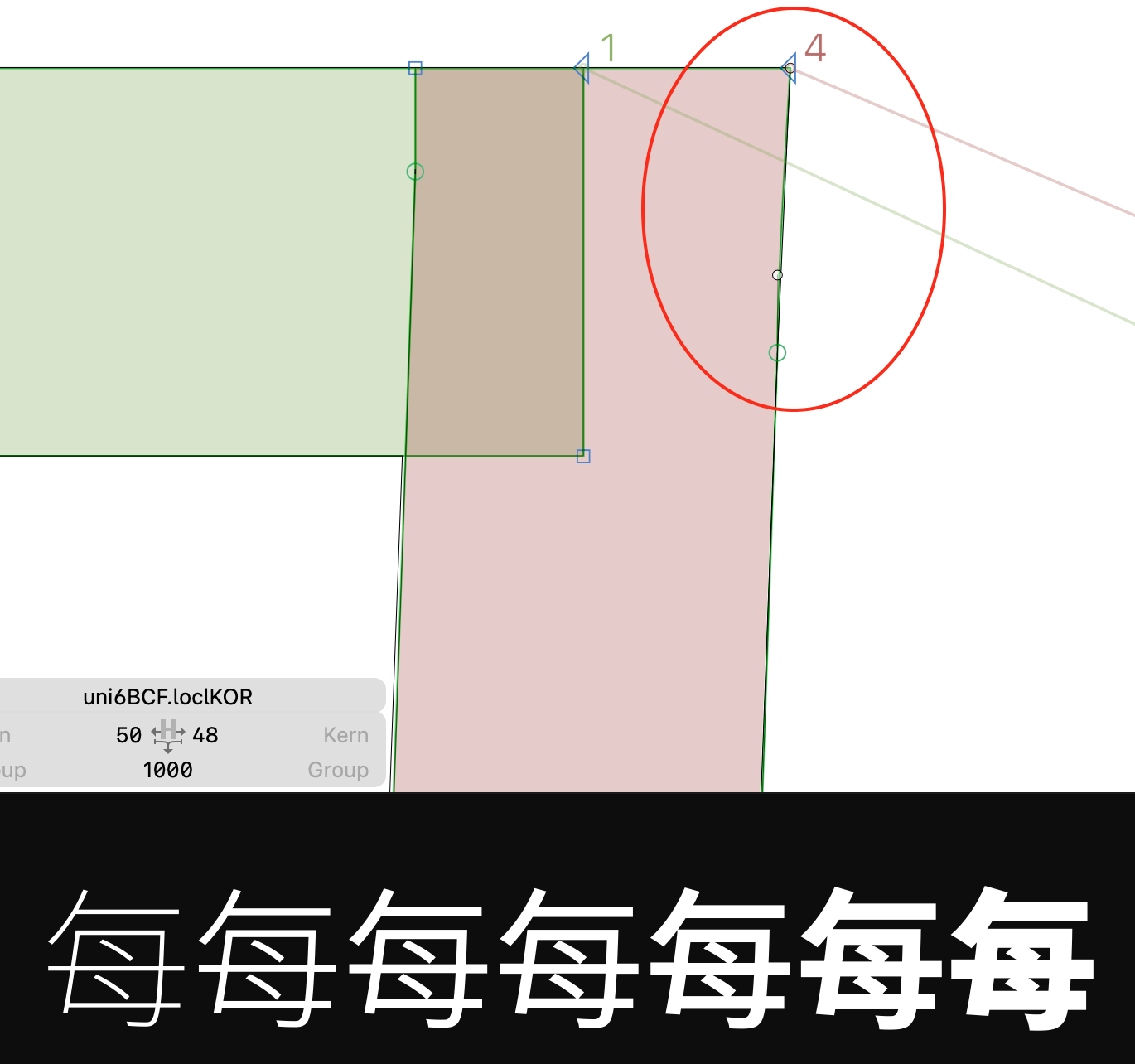
The solution is to remove the kinks and make the top left and right corner have a sharp curve node, as demonstrated in this picture. This could make for cleaner shapes.
Hướng dẫn đóng góp
Chưa lập chỉ mục được hướng dẫn đóng góp cho kho mã nguồn này
Đánh giá
Issue này chưa được đánh giá.