Icons are unintuitive
オープン
まだ誰も着手していません。
- 主要言語
- TypeScript
- スター
- 153
- フォーク
- 46
- 平均マージ
- 1日 8時間
- マージ済み PR(30日)
- 7
説明
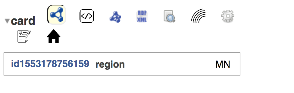
I just started checking out Solid today. After logging in and trying to edit my profile, I encounter a bunch of unhelpful icons. Above is one example, but these are all over the place.
- It wasn't immediately clear that these icons are buttons. I expect a standard design or color to identify them as buttons. There is also no hover/press state.
- I have no idea what the buttons do. Text would be much more clear.
- They do not use
<button>or<a>tags—this makes them less accessible.
I'd love it the UI switched over to using text buttons in a <button> tag. The icon could be kept alongside the text to accentuate it. If the style of a browser-default button is undesirable, consider making a standardized button style.
コントリビューションガイド
このリポジトリのコントリビューションガイドは索引されていません
はじめの一歩
- issue を最後まで読み、次にプロジェクトのコントリビューションガイドを読みます。
- 着手することを issue にコメントします — 二人が同じ作業をするのを防げます。
- リポジトリをフォークし、ブランチを切って変更します。
- issue 番号を参照したプルリクエストを送ります。
調査の方向性
まず、issue に記載されているプロフィール編集フローを再現し、スクリーンショットに表示されているアイコンのみのコントロールを洗い出します。これらのコントロールがどこでレンダリングされているかを特定し、それぞれに明確なテキストラベルがあり、適切な button または anchor 要素を使用し、ホバー時または押下時に視覚的なフィードバックを提供していることを確認します。アイコンだけに頼らなくても、対象のコントロールが理解しやすくアクセシブルであれば完了です。
索引モデルが issue の本文から書いたものです。
評価
- 技術スタック
- typescript
- 領域
- accessibility, design, frontend
- issue の種類
- 機能追加
- 難易度
- 4/5
- 見積もり時間
- 3〜5日
- 活発さ
- 停滞
- 明瞭さ
- おおむね明確
- 初心者へのやさしさ
- 35/100