DiscipleTools / DiscipleTools/disciple-tools-mobile-app
Improve the layout of the group health images
Open
- Dominant language
- JavaScript
- Stars
- 16
- Forks
- 18
- PR merge metrics
- No merged PRs in 30d
Description
Improve the layout of the group health images that display all the data (lots of the data is outside of the circles and overlaps)
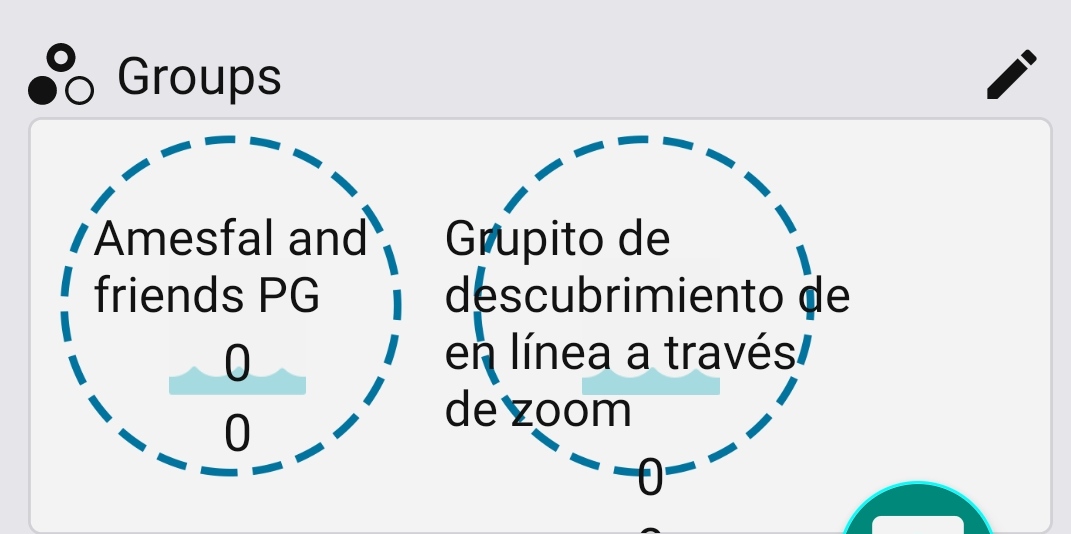
I suggest we have just the name of the group in the circle and have the count numbers below the circle next to the icons with a label they relate to.
Contributor guide
Assessment
This issue has not been assessed yet.