[Beta] Inconsistent Sandpack layout below 1280px
Nobody has claimed this yet.
- Dominant language
- JavaScript
- Stars
- 11.8k
- Forks
- 7.9k
- Avg merge
- 1d 11h
- Merged PRs (30d)
- 11
Description
I noticed that below the 1280px viewport, Sandpack has two different layouts, depending on whether it has the "Show More” button or not, which looks a bit inconsistent. So, I'd like to know if it's intended to be like that, or both sandpacks should have the same layout, regardless of their configuration.
| With show more button | Without show more |
|---|---|
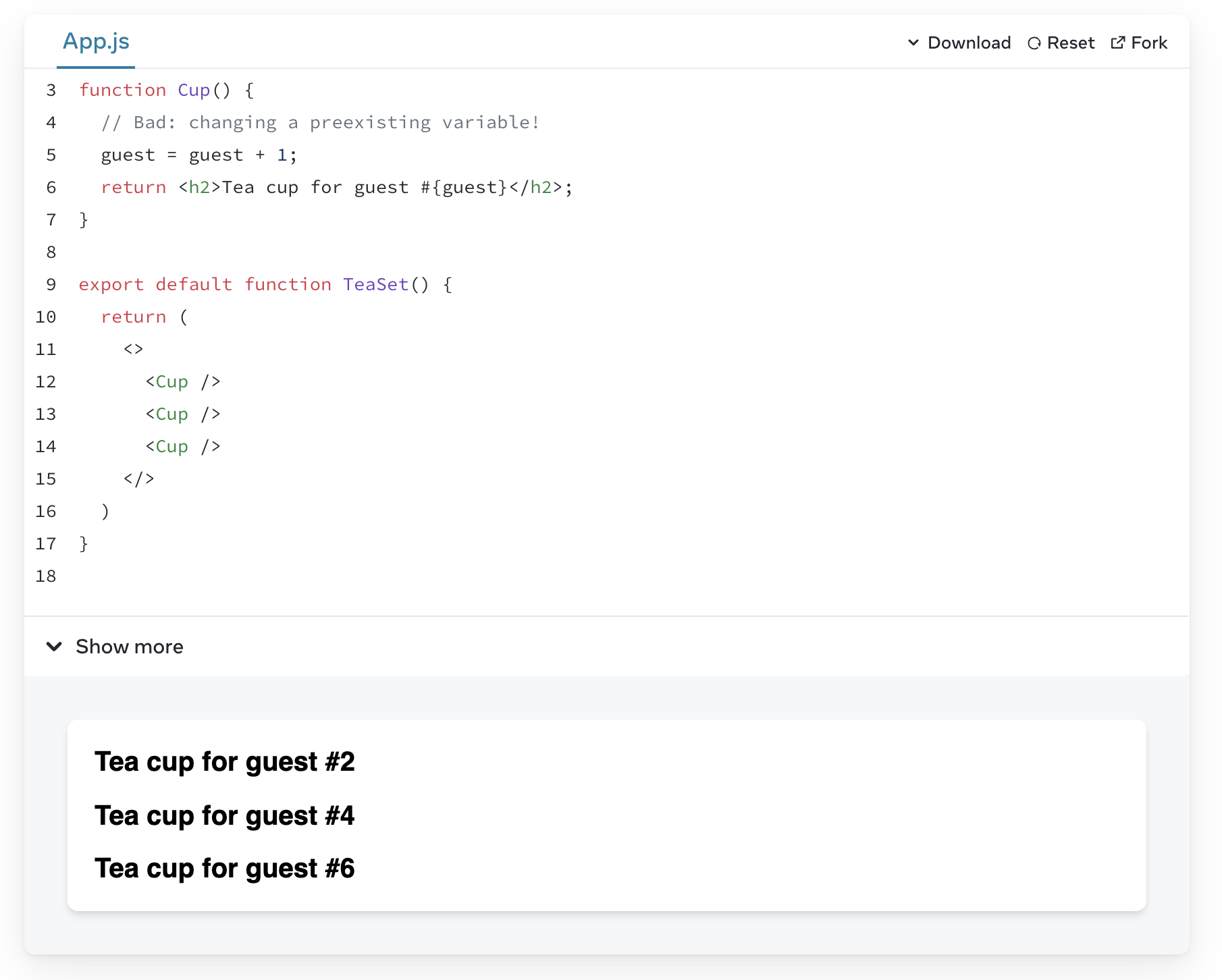 |
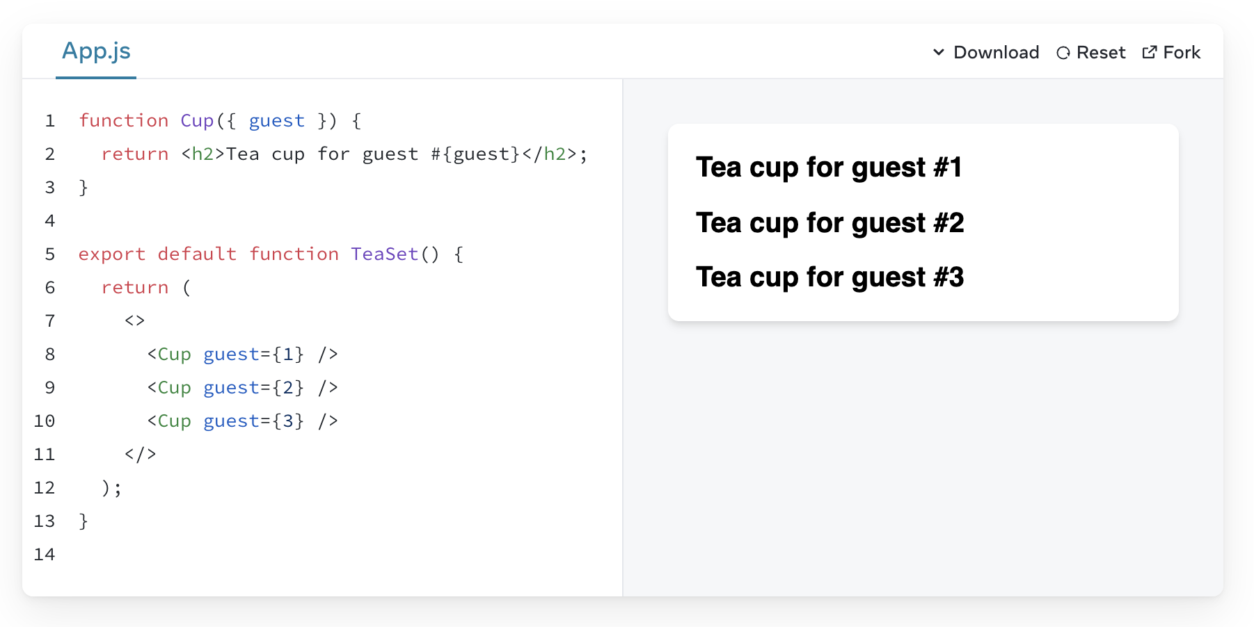 |
Contributor guide
First steps
- Read the whole issue, then the project's contributing guide.
- Comment on the issue to say you are picking it up — it saves two people doing the same work.
- Fork the repository and make your change on a branch.
- Open a pull request that references the issue number.
Research direction
Start by reproducing the two Sandpack layouts below the 1280px viewport, comparing the configurations shown in the issue screenshots. Trace the responsive layout entry point for Sandpack and determine whether the differing behavior is intentional; done means the layout is consistent for both configurations or the intended distinction is documented and verified.
Written by the indexing model from the issue text.
Assessment
- Tech stack
- javascript, react
- Domain
- frontend
- Issue type
- Bug
- Difficulty
- 3/5
- Estimated time
- 1-2 days
- Activity status
- Stale
- Clarity
- Mostly clear
- Newbie friendliness
- 40/100