python-visualization / python-visualization/folium
Add contour map functionality
未关闭
还没有人认领这个 Issue。
enhancement
- 主要语言
- Python
- 星标
- 7.4k
- 派生
- 2.3k
- 平均合并
- 17 小时 22 分钟
- 30 天内合并 PR
- 11
描述
Dear all
I would like to make a map of weather-like data as temperature or pressure on a folium map similar to the plot below (from https://cdoovision.com/us-temperature-contour-map/):
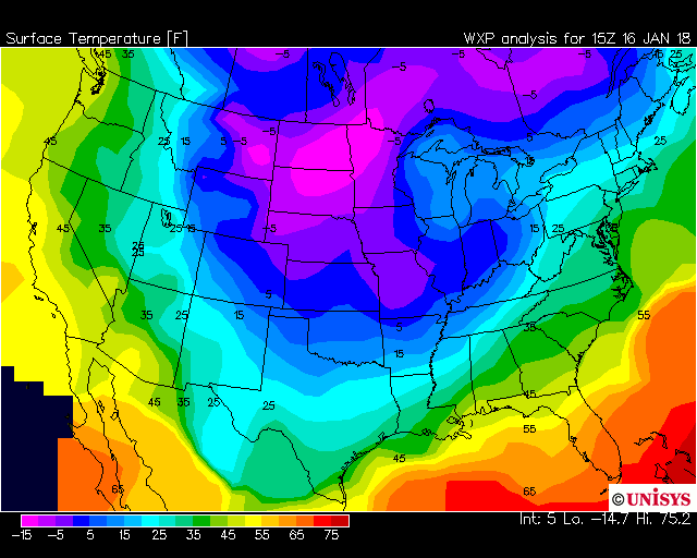
As it can be seen it is not a choropleth map as the contours go through the states and it is not a heatmap as I do not care how many measurements underlies this. The data I have is not gridded, but I have many individual measurements semi-randomly scattered over a large area.
Is this possible in folium currently in any way?
贡献指南
从这里开始
- 先读完整个 Issue,再读项目的贡献指南。
- 在 Issue 下留言说明你要接手 —— 这能避免两个人做同样的事。
- Fork 仓库,在一个分支上完成修改。
- 提交 Pull Request,并在描述里引用这个 Issue 编号。
调研方向
该 issue 未指定任何实现文件、测试或入口点。首先审查 Folium 现有的图层和数据可视化 API,以确定分散的测量值是否能够支持等值线地图;完成该工作需要定义 API,并为此类地图提供文档化支持。
由索引模型根据 Issue 内容生成。
评估
- 技术栈
- python
- 领域
- data-visualization
- Issue 类型
- 功能
- 难度
- 5/5
- 预计耗时
- 一周以上
- 活跃度
- 停滞
- 描述清晰度
- 需要澄清
- 新手友好度
- 20/100