Better selection highlighting for splom traces
Open
Nobody has claimed this yet.
feature
P2
- Dominant language
- JavaScript
- Stars
- 18.3k
- Forks
- 2k
- Avg merge
- 2d 12h
- Merged PRs (30d)
- 28
Description
Crossfiltering within a splom is perhaps its most powerful (and fun!) feature. We should make this better by:
- When there's a
splomtrace, makedragmode: 'select'the default, rather than'zoom', so more people are encouraged to find and use this! - Further fade the deselected points.
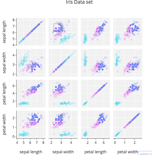
splomtraces encourage many small panes, which makes points overlap a lot, so the opacity we normally use for deselection builds up to the point you can't distinguish selected from deselected very well. We should decrease the opacity, and/or partially desaturate the colors, by default. Here's an example from https://plot.ly/python/splom/ - off-diagonal you can certainly see the selection, but it doesn't really pop out as much as it could. On diagonal, where the overlap is much greater, you can't even really see the selection:
Contributor guide
First steps
- Read the whole issue, then the project's contributing guide.
- Comment on the issue to say you are picking it up — it saves two people doing the same work.
- Fork the repository and make your change on a branch.
- Open a pull request that references the issue number.
Research direction
No files, tests, or entry points are named. Locate the splom trace handling, then inspect how dragmode defaults and deselected-point styling are selected; compare existing selection behavior before changing both defaults. Done means splom starts in select mode and selected points remain clearly distinguishable in dense panes.
Written by the indexing model from the issue text.
Assessment
- Tech stack
- javascript
- Domain
- data-visualization
- Issue type
- Feature
- Difficulty
- 4/5
- Estimated time
- 3-5 days
- Activity status
- Stale
- Clarity
- Mostly clear
- Newbie friendliness
- 35/100