Improve visualization
- Dominant language
- Python
- Stars
- 61
- Forks
- 16
- Avg merge
- 32m
- Merged PRs (30d)
- 8
Description
# Issue
## Problem Description
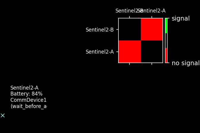
-) Visualization of the current activity fails if the activity has a long name
-) If satellites have a long name, the visualization in the table looks bad
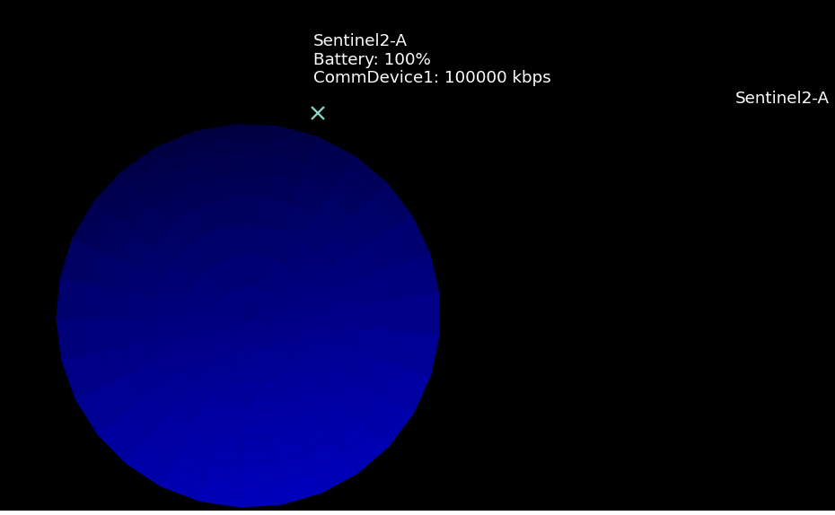
-) No table and satellite name shall be displaced when there is only one satellite in the communication table
## Expected Behavior
-) The name of the current activity shall be displayed correctly regardless of the length of the name
-) The name of the satellites shall be displayed correctly in the communication table regardless of the length of their names
-) No table and satellite name shall be displaced when there is only one satellite in the communication table
## What Needs to be Done
Fix problems before.
## How Can It Be Tested or Reproduced
The current version of #38 shall work correctly.
Contributor guide
No contributing guide indexed for this repository
Assessment
This issue has not been assessed yet.