adobe-fonts / adobe-fonts/source-code-pro
Improve readability of tilde and "almost equals" sign
- Linguagem predominante
- CSS
- Estrelas
- 20.4k
- Forks
- 1.6k
- Métricas de merge de PRs
- Nenhum PR com merge em 30d
Descrição
# Problem
**When using Source Code Pro, the readability of the tilde symbol (`~`) suffers at 11px on a 102ppi screen, as shown below. Example is the classic Bash prompt.**

Here is the tilde symbol in relation to its _character space_: (I apologize for my amateur terminology here)

**I think the both the tilde and the "almost equals" sign (`≈`) lack sufficient curvature to be readable in the situation I described above.**
# Examples of Solutions
Several other programming fonts have taken special approaches to designing the tilde symbol. Some are Input, Hack, and Iosevka. Screenshots of their designs are shown below:
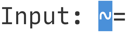
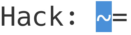
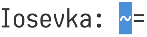
Here is the same Bash prompt in Hack:

# Solution
**In order to fix this issue, I propose an exaggeration of curvature in both `~` and `≈`.** I personally prefer _Hack_'s tilde the best.
Guia de contribuição
Nenhum guia de contribuição indexado para este repositório
Avaliação
Esta issue ainda não foi avaliada.