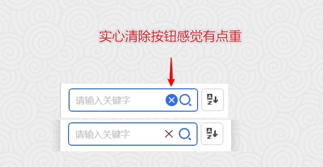
Clear button in SearchBar seems too heavy
Nobody has claimed this yet.
Assessment
- Difficulty
- 2/5
- Estimated time
- 1-3 hours
- Newbie friendliness
- 35/100
Research direction
Start at the SearchBar control and inspect how its clear button is styled and rendered. Compare it with the surrounding controls and the attached reference image; done means the clear button uses a lighter outline style and the SearchBar no longer appears visually right-heavy.
Written by the indexing model from the issue text.
Description
和其它部位风格不是很搭,显示后重心偏右了。感觉改成线条的风格好一点。供参考。
- Dominant language
- C#
- Stars
- 7.2k
- Forks
- 1.2k
- PR merge metrics
- No merged PRs in 30d
Contributor guide
No contributing guide indexed for this repository
First steps
- Read the whole issue, then the project's contributing guide.
- Comment on the issue to say you are picking it up — it saves two people doing the same work.
- Fork the repository and make your change on a branch.
- Open a pull request that references the issue number.
More from HandyOrg/HandyControl
-
Difficulty 2/5 1-3 hours Newbie friendliness 85/100
HandyOrg/HandyControl#1818 · 1 reaction ·
-
Difficulty 2/5 1-3 hours Newbie friendliness 72/100
HandyOrg/HandyControl#1809 ·
-
Difficulty 3/5 1-2 days Newbie friendliness 45/100
HandyOrg/HandyControl#1820 ·
-
不能够独立的引入用户认为需要的部分 Open
Difficulty 4/5 3-5 days Newbie friendliness 48/100
HandyOrg/HandyControl#1816 · 1 comment ·
-
Difficulty 3/5 1-2 days Newbie friendliness 45/100
HandyOrg/HandyControl#1813 ·
All issues in HandyOrg/HandyControl
Similar issues
-
bug
Difficulty 1/5 Under an hour Newbie friendliness 75/100
sillsdev/languageforge-lexbox#2665 ·
-
bug documentation frontend
Difficulty 2/5 1-3 hours Newbie friendliness 72/100
azurenoops/spin_agent#975 ·
-
Difficulty 2/5 1-3 hours Newbie friendliness 86/100
-
:watch: Not Triaged 11.0 fundamentals/subsvc
Difficulty 2/5 1-3 hours Newbie friendliness 92/100
dotnet/AspNetCore.Docs#37699 ·
-
Difficulty 2/5 1-3 hours Newbie friendliness 72/100
SubtitleEdit/subtitleedit#15108 · 1 comment ·