workbenchdev / workbenchdev/Workbench
Screen size simulator
Open
Nobody has claimed this yet.
enhancement
- Dominant language
- JavaScript
- Stars
- 844
- Forks
- 91
- Avg merge
- 7h 12m
- Merged PRs (30d)
- 1
Description
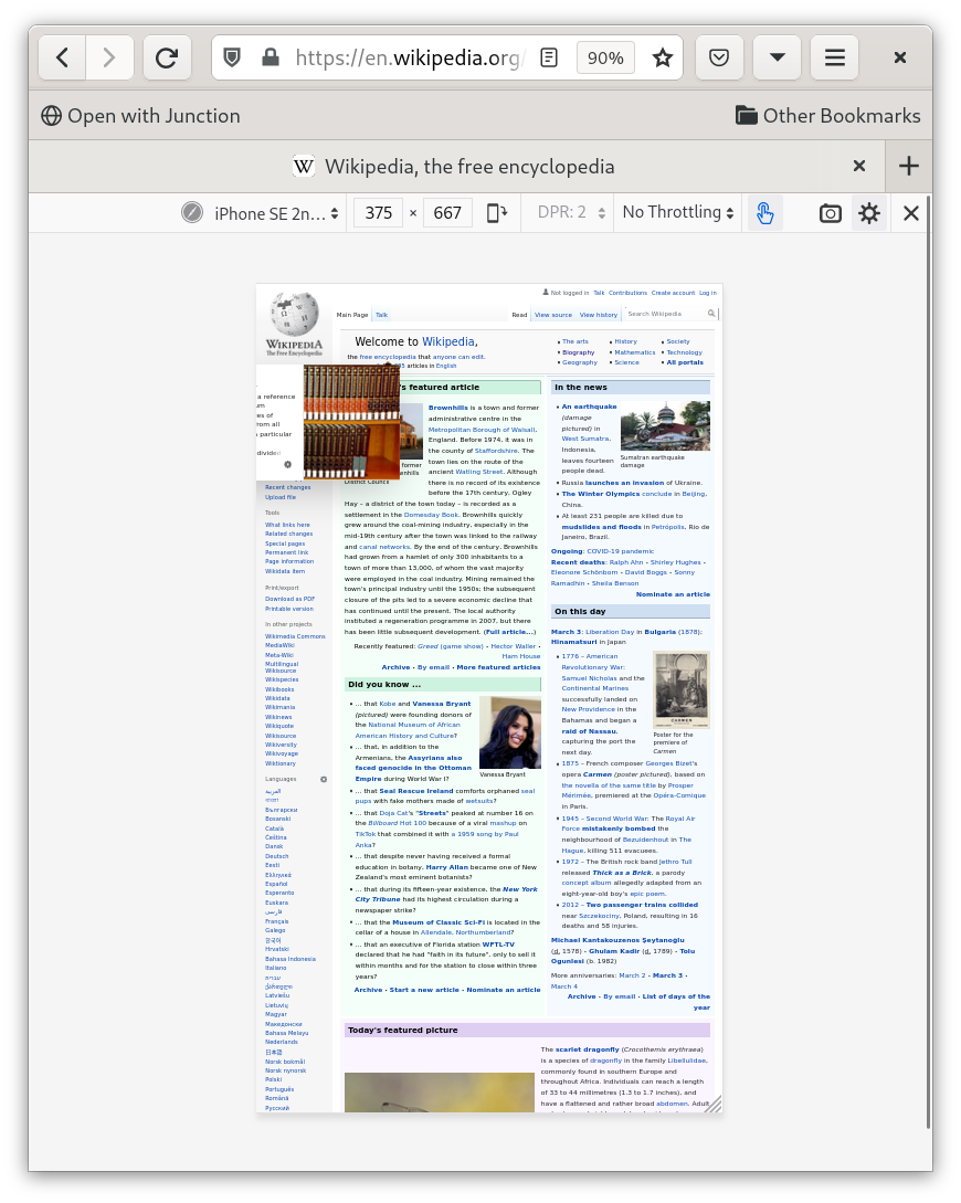
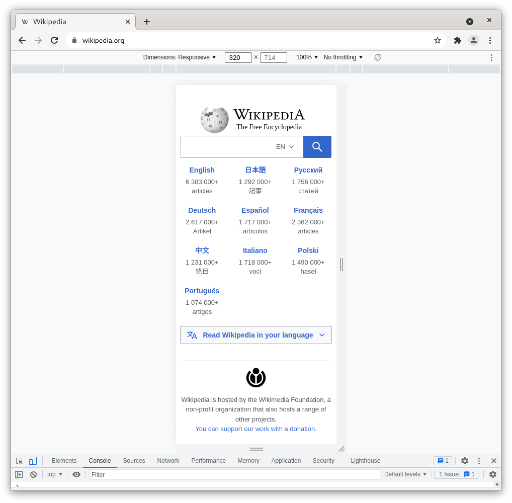
Browsers devtools have a tool to reduce the size of the viewport in order to see what the website looks like on different devices (phones, tablets, laptop, ...)
Would be awesome to have something similar
Prior work
Firefox "Repsonse Design Mode'
Chrome "Device toolbar"
Contributor guide
First steps
- Read the whole issue, then the project's contributing guide.
- Comment on the issue to say you are picking it up — it saves two people doing the same work.
- Fork the repository and make your change on a branch.
- Open a pull request that references the issue number.
Research direction
No files, tests, or entry points are named. Review the referenced Firefox and Chrome device-mode examples, then determine the scope and interaction design for a simulator that previews websites at phone, tablet, and laptop viewport sizes.
Written by the indexing model from the issue text.
Assessment
- Tech stack
- javascript
- Domain
- desktop
- Issue type
- Feature
- Difficulty
- 5/5
- Estimated time
- Over a week
- Activity status
- Stale
- Clarity
- Needs clarification
- Newbie friendliness
- 30/100