wordpress-mobile / wordpress-mobile/WordPress-Android
Improve notifications screen animation
Open
Nobody has claimed this yet.
[Type] Enhancement
Notifications
- Dominant language
- Kotlin
- Stars
- 3.2k
- Forks
- 1.4k
- Avg merge
- 1d 11h
- Merged PRs (30d)
- 69
Description
Actual behavior
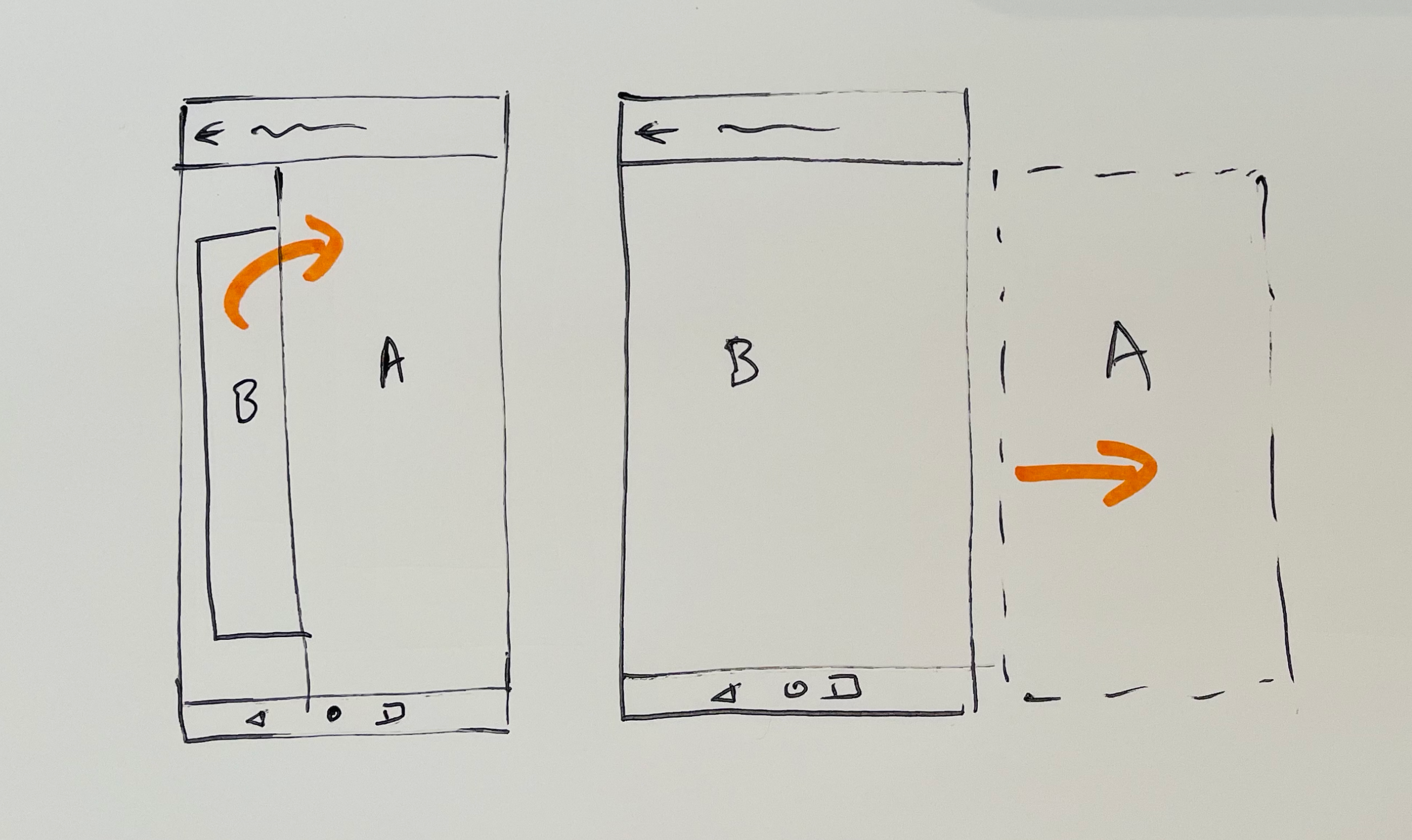
- On the notifications tab, when you swipe to move between notifications, the current notification (A) is shown a level above the next notification (B) on the Z-axis.
- The next notification (B) is slightly reduced in size and opacity, but then animates to full size and opacity from behind the other one (A)
- The initial notification (A) moves horizontally out of the device frame.
Here's a sketch and a very rough video to describe it.
Issues
- In the current solution, because notification B is 'behind' and smaller than notification A, I think it implies that there is a hierarchical or child/parent relationship between these two.
- It feels like the app is going up/back to the notification screen.
Expected behavior
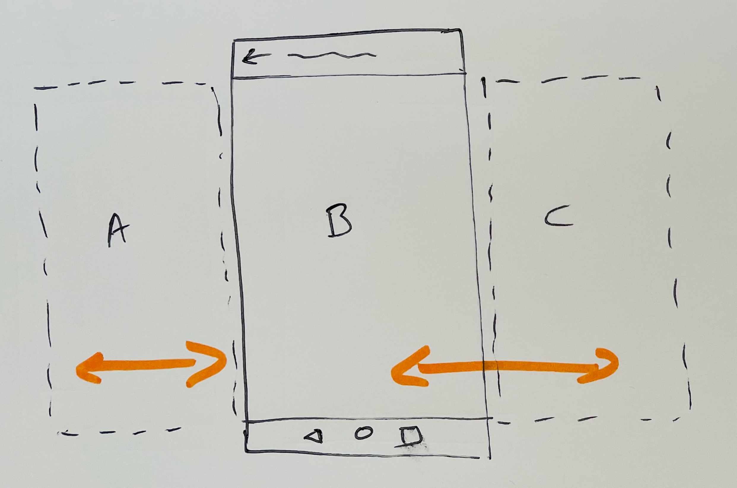
- These notifications are actually at an equal level of hierarchy. They are in a list. But they don't have a parent/child relationship. They are siblings of equal level.
- It might work better if they all just moved horizontally, with no shrinking or transparency.
- We could avoid the overlay issue entirely. The notifications would just swiped left/right on an infinite horizontal plane. It would be like they are all on one long sheet, and the device screen is a window framing one of them at at a time.
Here's a sketch and a very rough video to describe it.
PS: Description is taken from https://github.com/wordpress-mobile/WordPress-Android/issues/14919#issuecomment-908503715.
Contributor guide
First steps
- Read the whole issue, then the project's contributing guide.
- Comment on the issue to say you are picking it up — it saves two people doing the same work.
- Fork the repository and make your change on a branch.
- Open a pull request that references the issue number.
Research direction
Start at the notifications tab implementation and compare the current swipe transition with the attached sketches and videos. Clarify the intended horizontal transition and its acceptance criteria before changing it, then verify that swiping between notifications treats them as equal-level items without the current hierarchy cues.
Written by the indexing model from the issue text.
Assessment
- Tech stack
- kotlin
- Domain
- design, mobile
- Issue type
- Feature
- Difficulty
- 5/5
- Estimated time
- Over a week
- Activity status
- Stale
- Clarity
- Needs clarification
- Newbie friendliness
- 30/100