wordpress-mobile / wordpress-mobile/WordPress-Android
Quick Start section is limited to My Site fixed width on tablets
Nobody has claimed this yet.
- Dominant language
- Kotlin
- Stars
- 3.2k
- Forks
- 1.4k
- Avg merge
- 1d 11h
- Merged PRs (30d)
- 69
Description
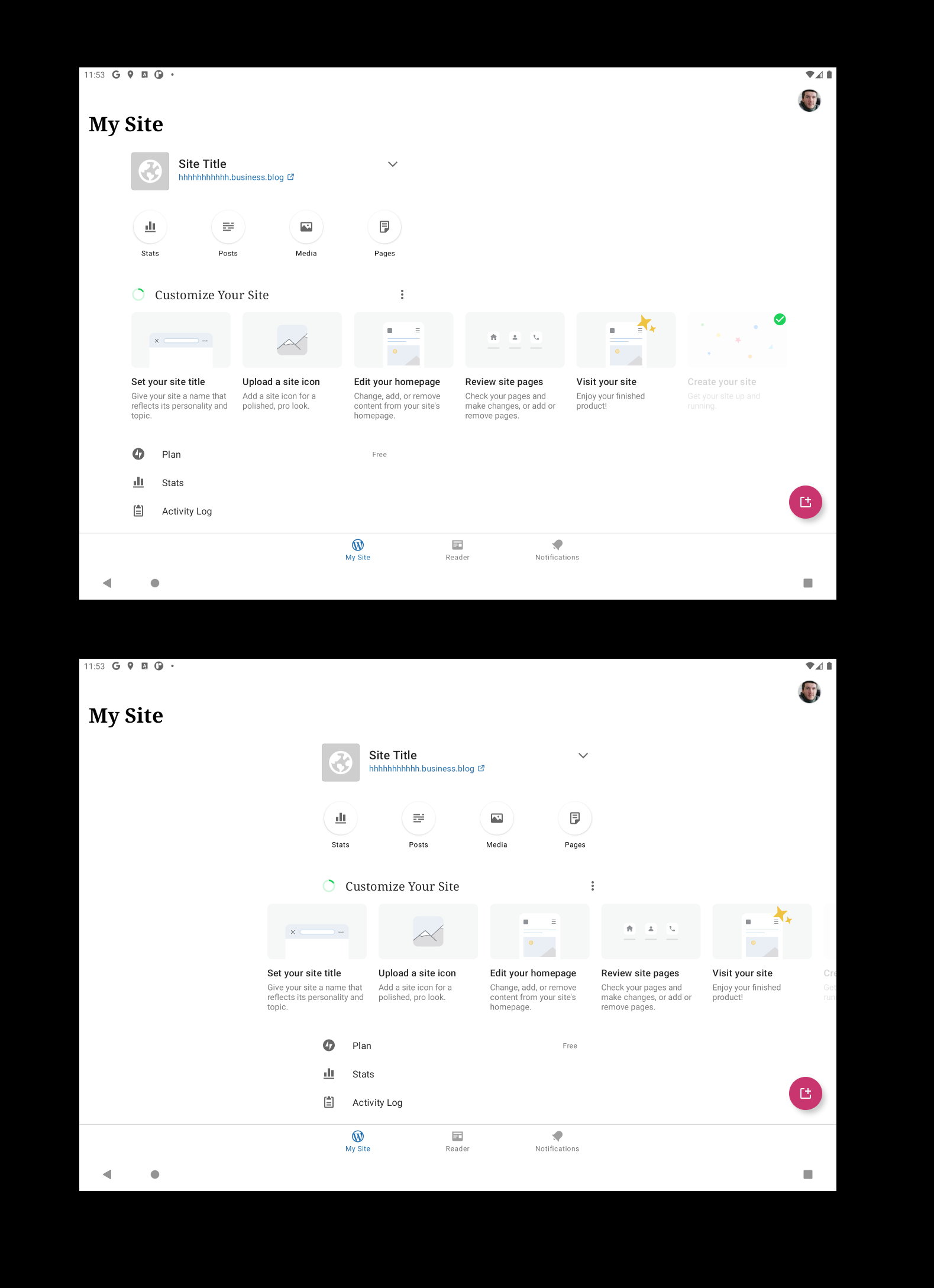
The My Site screen has a fixed width to prevent the layout from being too spread out on tablets, which could cause the Quick Start focus points to be very far from their actual targets, among other things.
The Quick Start section should not be limited to this fixed width and its cards can be able to flow across the entire screen. @osullivanchris has shared a couple of options on how to deal with this here:
- First one has the fixed width layout to the left rather than centre of the screen, and the carousel spills over
- The second one keeps it centred. Carousel spills over. Would start aligned left with the row, spilling over to the right, then I've showed it as the user scrolls - with content spilling over to the left too.
Contributor guide
First steps
- Read the whole issue, then the project's contributing guide.
- Comment on the issue to say you are picking it up — it saves two people doing the same work.
- Fork the repository and make your change on a branch.
- Open a pull request that references the issue number.
Research direction
Start at the My Site screen and inspect how its tablet layout constrains the Quick Start section. Compare the two layout options linked in the issue, then verify on a tablet that the Quick Start cards can flow across the full screen without placing focus points far from their targets.
Written by the indexing model from the issue text.
Assessment
- Tech stack
- kotlin
- Domain
- mobile
- Issue type
- Bug
- Difficulty
- 3/5
- Estimated time
- 1-2 days
- Activity status
- Stale
- Clarity
- Mostly clear
- Newbie friendliness
- 35/100