wordpress-mobile / wordpress-mobile/WordPress-Android
Preview bottom toolbar border-top is too strong
Open
Nobody has claimed this yet.
[Type] Enhancement
General
- Dominant language
- Kotlin
- Stars
- 3.2k
- Forks
- 1.4k
- Avg merge
- 1d 11h
- Merged PRs (30d)
- 69
Description
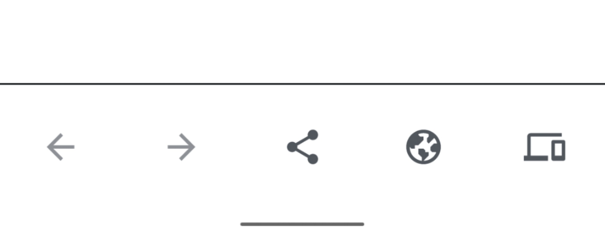
The bottom toolbar on the editor preview screen has what looks like a black border-top, whereas it should be dimmer – probably the same color as on Bottom Navigation and single-article view on Reader.
Steps to reproduce the behavior
- Open a post or page (using either Aztec or Gutenberg)
- Add some content
- Tap
•••menu in app bar - Tap
Previewin menu - See preview
Tested on Pixel 4, Android 10, WPAndroid 13.9 alpha
Contributor guide
First steps
- Read the whole issue, then the project's contributing guide.
- Comment on the issue to say you are picking it up — it saves two people doing the same work.
- Fork the repository and make your change on a branch.
- Open a pull request that references the issue number.
Research direction
Start by reproducing the editor preview flow on Android and compare the bottom toolbar with Bottom Navigation and the single-article Reader view. Locate the preview toolbar styling, then verify that its top border uses the dimmer appearance described in the issue.
Written by the indexing model from the issue text.
Assessment
- Tech stack
- android, kotlin
- Domain
- design, mobile
- Issue type
- Bug
- Difficulty
- 2/5
- Estimated time
- 1-3 hours
- Activity status
- Stale
- Clarity
- Mostly clear
- Newbie friendliness
- 45/100