wallabag / wallabag/android-app
Improve dark (high contrast) theme
- Dominant language
- Java
- Stars
- 587
- Forks
- 276
- PR merge metrics
- No merged PRs in 30d
Description
**wallabag app version**: master branch (b55623d9b2ce9e375b012ee127e5b4984126e1d9)
There are incorrect colors in dark (high contrast) theme. The issues are ordered from most important to less (for me).
Buttons with black background and white border and text?
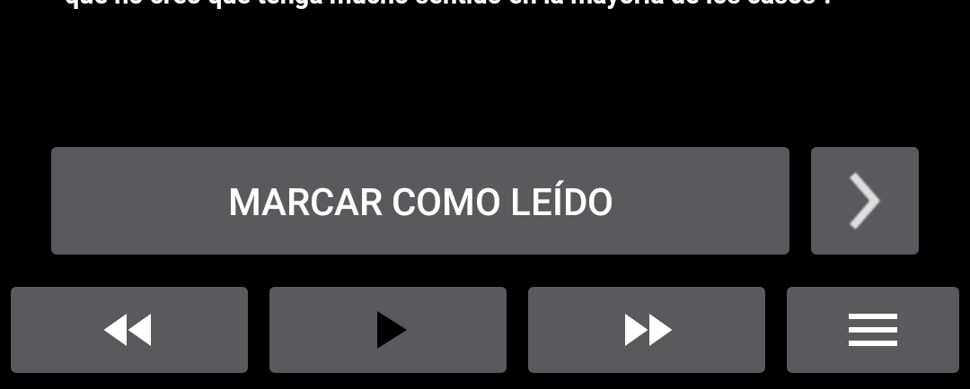
I don't understand the purpose of the icon near the domain name. Remove? White with transparent/black background? Inverted colors (it's possible to do it in css)?

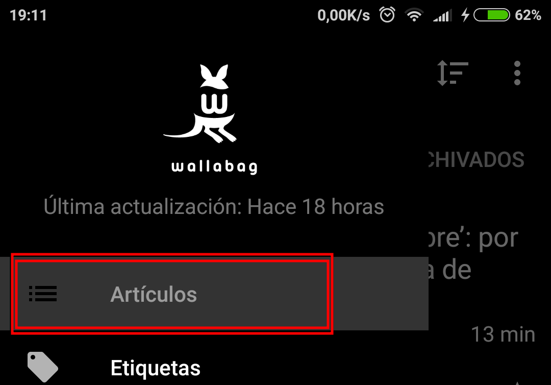
There is not enough contrast in the selected menu (Article)
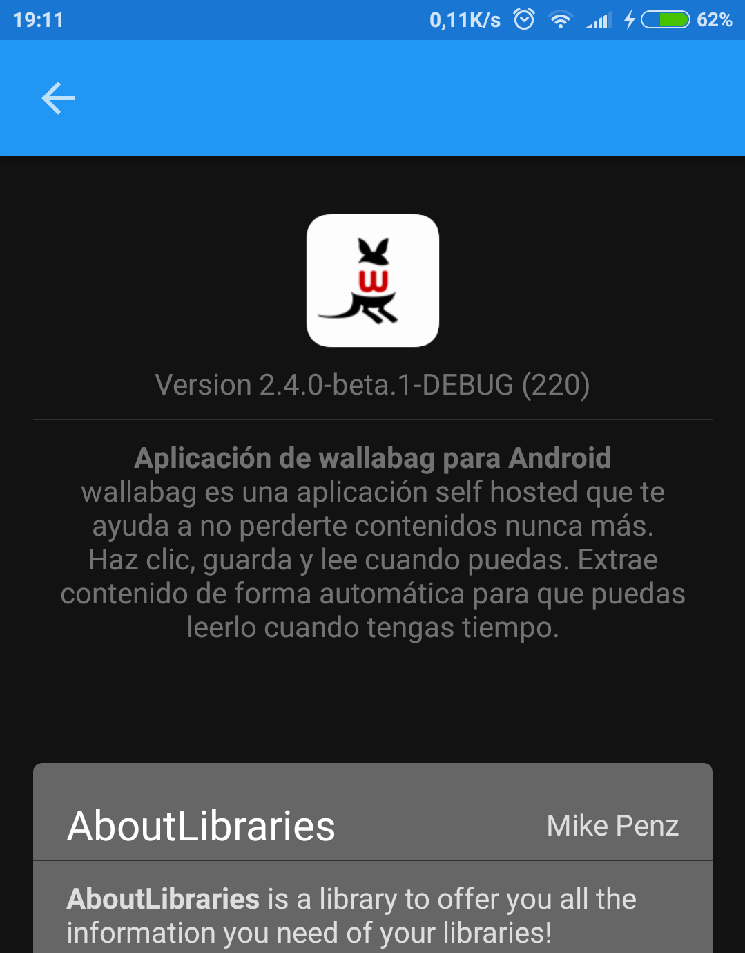
About libraries should be black not grey:
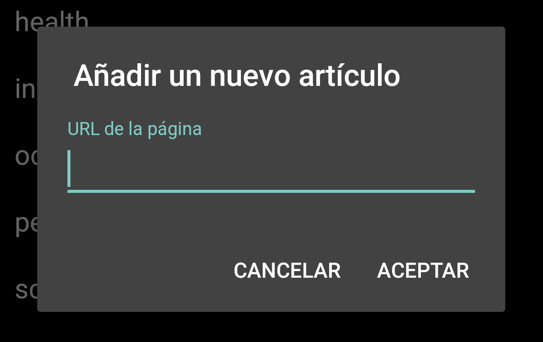
Add new article should be black too (all modal dialog really):
Contributor guide
No contributing guide indexed for this repository
Assessment
This issue has not been assessed yet.