wallabag / wallabag/android-app
Dark mode element delineation
- Dominant language
- Java
- Stars
- 587
- Forks
- 276
- PR merge metrics
- No merged PRs in 30d
Description
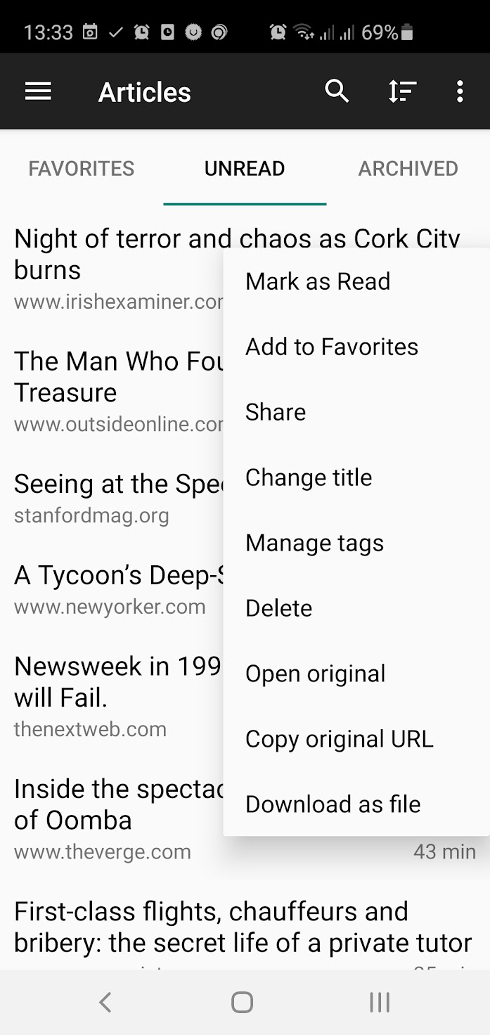
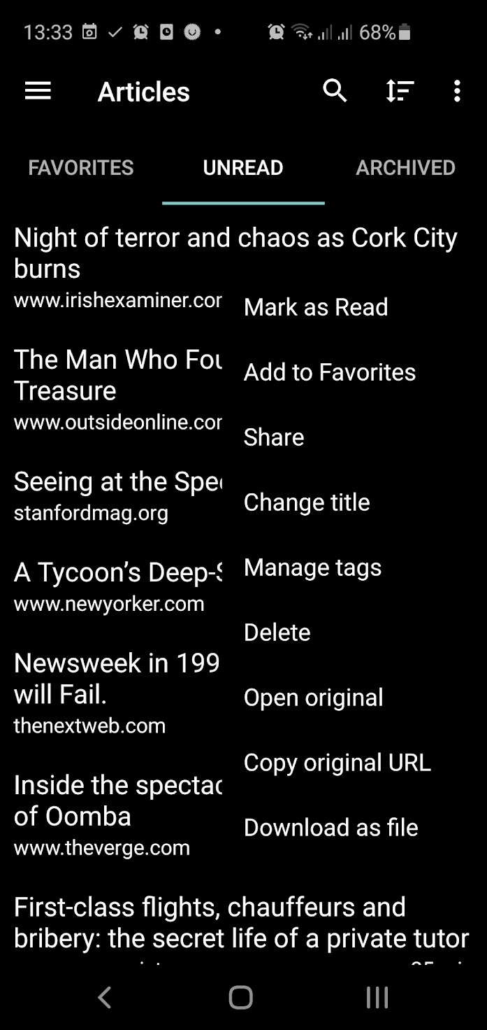
The list of articles is a little awkward to parse as there's no delineation between items, or menus.
I've attached screenshots from light and dark as examples, the drop shadow in the menu on light separates it from the list, but there's nothing in dark mode (or rather there is, but it's a dark drop shadow). A 1px border would fix this if a light drop shadow is a problem.
The lack of delineation between items bothers me more though, most apps have a 1px line between items and indeed that's the case in the Wallabag settings. Appreciate if you could add this, or make it an option if others don't like it.
Latest app, from Play, S10E, Android 10
Contributor guide
No contributing guide indexed for this repository
Research direction
No files or tests are named. Start by locating the Android article-list and menu styling entry points, then compare their light and dark themes with the attached screenshots. Done means the menu is visibly separated in dark mode and article items have clear separators without harming the existing light theme.
Written by the indexing model from the issue text.
Assessment
- Tech stack
- android, java
- Domain
- design, mobile
- Issue type
- Feature
- Difficulty
- 3/5
- Estimated time
- 1-2 days
- Activity status
- Stale
- Clarity
- Mostly clear
- Newbie friendliness
- 48/100