Redesign mobile header area
Open
@Raghaddahi is already working on this.
Since Jul 22, 2026.
- Dominant language
- Python
- Stars
- 36
- Forks
- 39
- Avg merge
- 2d 5h
- Merged PRs (30d)
- 3
Description
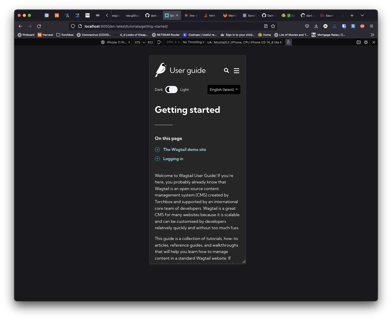
The mobile version of the site is looking quite cluttered, we currently have the logo, search, burger menu, language switcher and dark/light theme switcher.
We should consider whether users need to always see all of these elements.
I'd suggest moving both the language switcher and theme switcher to sit within the burger menu. This would tidy up the first visible area of the site for mobile users.
Screenshot attached of current setup:
Contributor guide
First steps
- Read the whole issue, then the project's contributing guide.
- Comment on the issue to say you are picking it up — it saves two people doing the same work.
- Fork the repository and make your change on a branch.
- Open a pull request that references the issue number.
Assessment
This issue has not been assessed yet.