Best practice of visual presentation of hierarchy tree
Nobody has claimed this yet.
- Dominant language
- Kotlin
- Stars
- 7.9k
- Forks
- 914
- PR merge metrics
- No merged PRs in 30d
Description
Hey guys. Regarding visual presentation of the hierarchy tree
of the architecture of the App...,
Would you rather display it like A (left) or B (right)
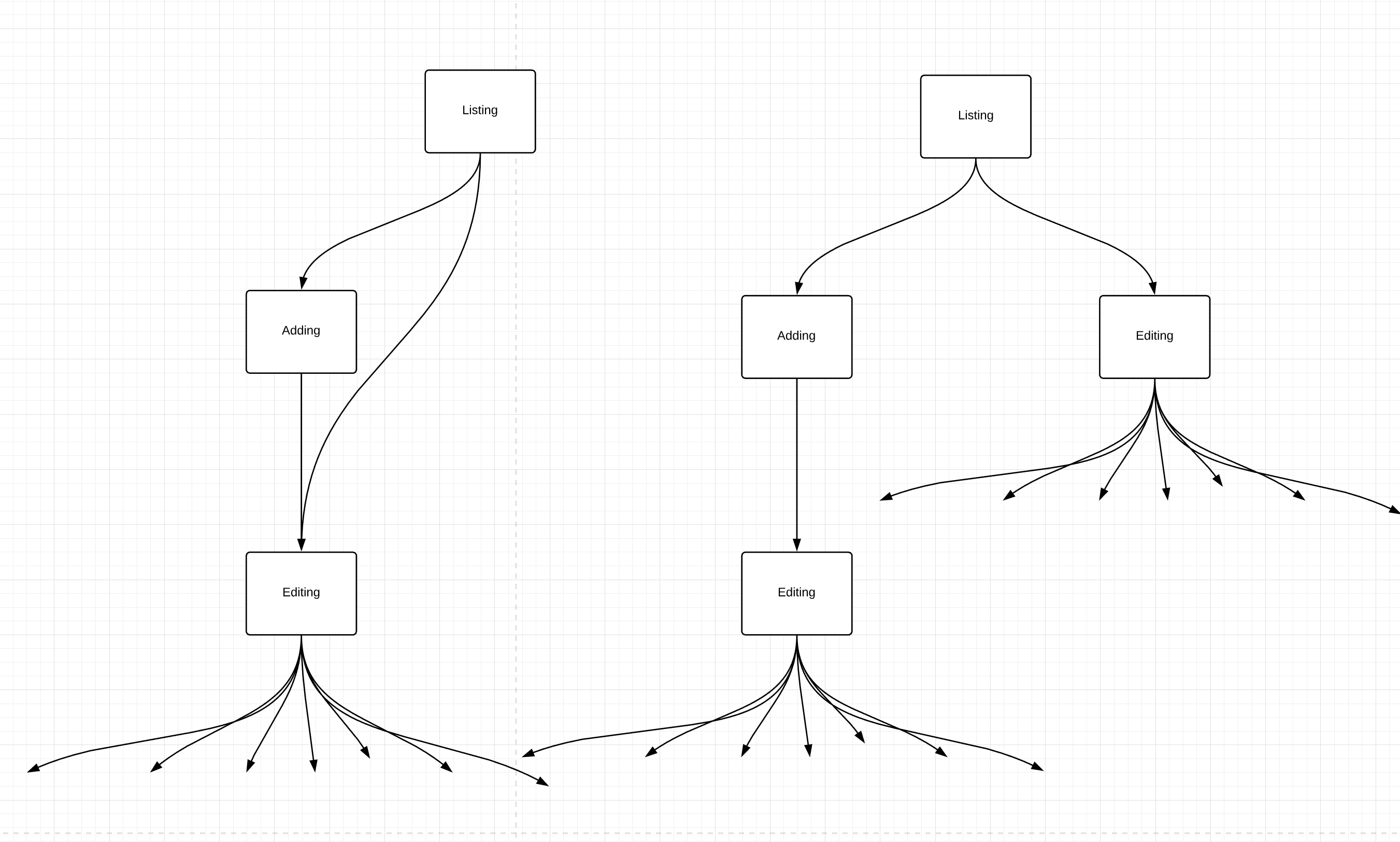
The question is here for whatever cost (lots of duplicates) stick to the tree presentation (B).
Or having 1-2 more "nested" RIB flows (A)?
Listing: logic and UI to display existing elements, buttons to edit single element and add elements.
Adding: contains logic to create a new element and route it to editing.
Editing: contains logic and UI to edit an element.
Contributor guide
First steps
- Read the whole issue, then the project's contributing guide.
- Comment on the issue to say you are picking it up — it saves two people doing the same work.
- Fork the repository and make your change on a branch.
- Open a pull request that references the issue number.
Research direction
The issue contains no files, tests, or entry points to inspect. Start by reviewing the hierarchy-tree presentation and the Listing, Adding, and Editing flows described in the issue. Done would require an agreed decision between the two proposed layouts and a defined implementation scope.
Written by the indexing model from the issue text.
Assessment
- Domain
- design
- Issue type
- Feature
- Difficulty
- 5/5
- Estimated time
- Over a week
- Activity status
- Stale
- Clarity
- Needs clarification
- Newbie friendliness
- 20/100