swagger-api / swagger-api/swagger-ui
Better separation or distinction between actual server response and example server response sections
Nobody has claimed this yet.
- Dominant language
- JavaScript
- Stars
- 29k
- Forks
- 9.3k
- Avg merge
- 2d 23h
- Merged PRs (30d)
- 25
Description
Content & configuration
Not relevant to this report. The issue relates to a problem with SwaggerUI's graphical user interface that's been neglected for 3-4 years.
Is your feature request related to a problem?
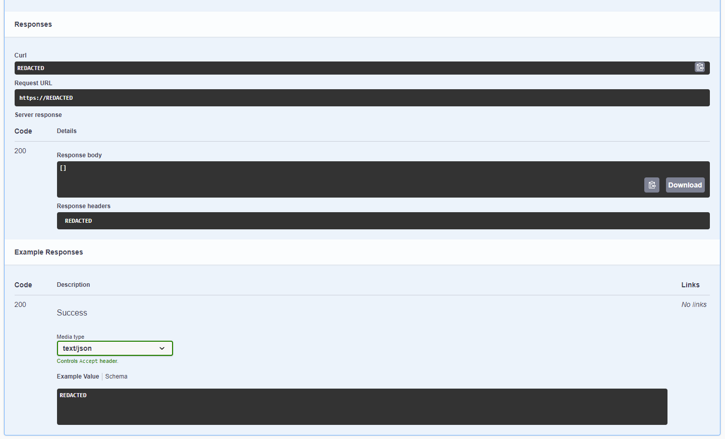
Yes. People using SwaggerUI find it difficult to tell the examples apart from actual server responses. This has happened within my team and to other people too https://github.com/swagger-api/swagger-ui/issues/3546. I surmise other people have been caught by this but not bothered to file a report.

Describe the solution you'd like
A clearer distinction between the actual server response and example server responses sections.
Please consider using different heading or background colors to create a clearer and more immediate separation between those two sections.
An example of a simple solution that would address this problem:
Describe alternatives you've considered
Use a browser stylesheet (e.g. GreaseMonkey), not an acceptable solution because it doesn't propagate the fix to other people using the tool.
Additional context
Contributor guide
First steps
- Read the whole issue, then the project's contributing guide.
- Comment on the issue to say you are picking it up — it saves two people doing the same work.
- Fork the repository and make your change on a branch.
- Open a pull request that references the issue number.
Research direction
The issue concerns Swagger UI's graphical response sections but names no implementation file or test. Start by locating where actual server responses and example responses are rendered, then inspect their current styling and related UI tests if present. Done means users can immediately distinguish the two sections through clearer headings or background treatment.
Written by the indexing model from the issue text.
Assessment
- Tech stack
- css, javascript
- Domain
- design, frontend
- Issue type
- Feature
- Difficulty
- 3/5
- Estimated time
- 1-2 days
- Activity status
- Quiet
- Clarity
- Mostly clear
- Newbie friendliness
- 52/100