swagger-api / swagger-api/swagger-ui
Parameters rendering lacks visual clues and wastes a lot of screen space
Nobody has claimed this yet.
- Dominant language
- JavaScript
- Stars
- 29k
- Forks
- 9.3k
- Avg merge
- 2d 23h
- Merged PRs (30d)
- 25
Description
| Q | A |
|---|---|
| Bug or feature request? | Bug |
| Which Swagger/OpenAPI version? | v2 |
| Which Swagger-UI version? | Every v3 version to date |
| How did you install Swagger-UI? | Copy dist directory |
| Which browser & version? | Chrome, firefox, internet explorer |
| Which operating system? | Any |
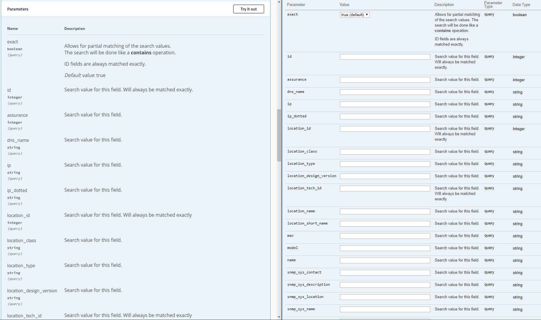
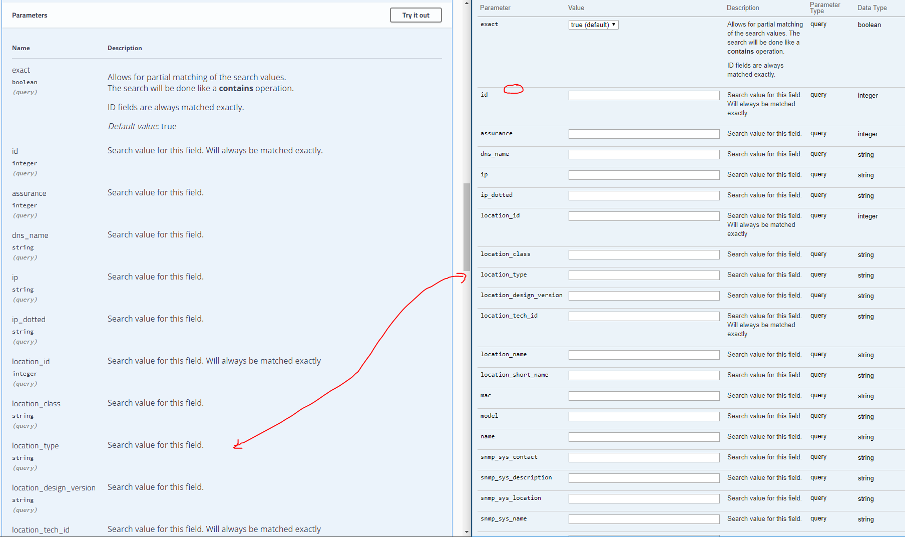
When rendering a large APIs with endpoints with a lot of parameters (let say >10) the swagger v3 layout becomes very hard to read. In v2 there was a horizontal rule providing a visual clue between parameters, now it's sort of a big text blob in various fonts.
Besides that, there is a lot of lost space making you have to scroll endlessly through the parameters.
The same goes for the model rendering.
See screenshot below with a comparison.
Contributor guide
First steps
- Read the whole issue, then the project's contributing guide.
- Comment on the issue to say you are picking it up — it saves two people doing the same work.
- Fork the repository and make your change on a branch.
- Open a pull request that references the issue number.
Research direction
Start by inspecting Swagger UI's parameter and model rendering areas and compare the current v3 layout with the linked screenshots and the former v2 presentation. The work is done when parameters and models have clearer visual separation and use substantially less vertical space across the reported browsers.
Written by the indexing model from the issue text.
Assessment
- Tech stack
- javascript
- Domain
- frontend
- Issue type
- Bug
- Difficulty
- 3/5
- Estimated time
- 1-2 days
- Activity status
- Stale
- Clarity
- Mostly clear
- Newbie friendliness
- 35/100