swagger-api / swagger-api/swagger-ui
Visibility of `Example Value | Model` tabs bad
Open
Nobody has claimed this yet.
cat: style & presentation
type: enhancement
- Dominant language
- JavaScript
- Stars
- 29k
- Forks
- 9.3k
- Avg merge
- 2d 23h
- Merged PRs (30d)
- 25
Description
On firefox / linux the pipe gets mixed into the text:
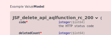
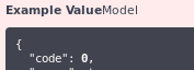
But even on macos its not really visible that these are tabs which the user can toggle.
Please improve the visibility of these elements.
Contributor guide
First steps
- Read the whole issue, then the project's contributing guide.
- Comment on the issue to say you are picking it up — it saves two people doing the same work.
- Fork the repository and make your change on a branch.
- Open a pull request that references the issue number.
Research direction
Use the attached Firefox/Linux and macOS screenshots as the starting reference, then inspect the Example Value and Model tab controls in Swagger UI. Improve the distinction between the tabs and the pipe separator without changing their purpose. Done means the controls are visibly toggleable and the pipe no longer blends into the text in Firefox on Linux.
Written by the indexing model from the issue text.
Assessment
- Tech stack
- javascript
- Domain
- design, frontend
- Issue type
- Bug
- Difficulty
- 3/5
- Estimated time
- 1-2 days
- Activity status
- Stale
- Clarity
- Needs clarification
- Newbie friendliness
- 35/100