New clear selection button is styled as a button by Chrome and looks terrible
Open
Nobody has claimed this yet.
4.x
confirmed bug
styling
- Dominant language
- JavaScript
- Stars
- 25.9k
- Forks
- 6.1k
- Avg merge
- 8d 53m
- Merged PRs (30d)
- 4
Description
Using version 4.1.0-rc.0 and bootstrap 5 gives this:-
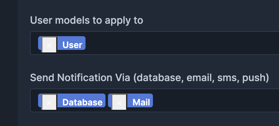
Caused by the element now being a button instead of a span

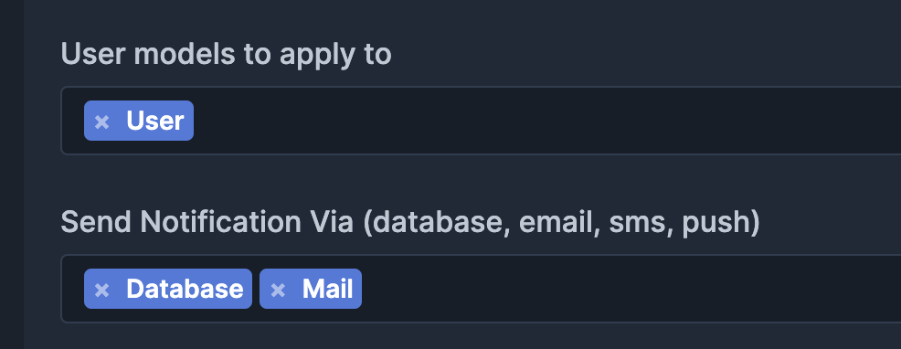
With v4.0.13 the clear selection X is still a span and looks perfect:-
Styling appears to be coming from Chrome user agent stylesheet.
Can be fixed with:-
.select2-container--default .select2-selection--multiple .select2-selection__choice__remove {
    background-color: transparent;
    padding: 0;
    border: none;
}
Contributor guide
First steps
- Read the whole issue, then the project's contributing guide.
- Comment on the issue to say you are picking it up — it saves two people doing the same work.
- Fork the repository and make your change on a branch.
- Open a pull request that references the issue number.
Research direction
Start by reproducing the multiple-selection clear button styling in Chrome with Bootstrap 5 and inspect the default Select2 theme styles for the selector shown in the issue. Compare the result with version 4.0.13; done means the clear-selection control no longer shows Chrome's default button appearance and matches the expected styling.
Written by the indexing model from the issue text.
Assessment
- Tech stack
- bootstrap, javascript, jquery
- Domain
- design, frontend
- Issue type
- Bug
- Difficulty
- 1/5
- Estimated time
- Under an hour
- Activity status
- Stale
- Clarity
- Clearly specified
- Newbie friendliness
- 35/100