Domino plot/cell information in dotplot
Nobody has claimed this yet.
- Dominant language
- Python
- Stars
- 2.6k
- Forks
- 779
- Avg merge
- 1d 4h
- Merged PRs (30d)
- 27
Description
- Additional function parameters / changed functionality / changed defaults?
- New analysis tool: A simple analysis tool you have been using and are missing in
sc.tools? - New plotting function: A kind of plot you would like to seein
sc.pl? - External tools: Do you know an existing package that should go into
sc.external.*? - Other?
Hi all!
My use case for scanpy is analysis of whole-body data from a weird marine annelid. We sort of have an idea of what to expect, but a lot of the analysis is exploratory, and my main job is helping canalize the knowledge that is available in the lab into making sense of the data.
In this context, dotplots are our best friend, as it provides a very nice summary of gene expression over the whole (clustered) dataset. However, yesterday we noticed a confusing edge case: let’s say gene $g$ is expressed in the same number of cells in two clusters, 4 and 23. Cluster 4 has many, many more cells than 23, therefore on the dotplot it will look like $g$
is barely expressed in 4, but a great marker for 23. Of course, combining a dotplot with a feature plot helps you see that, but you get no sense of how many cells those are (more/less/the same).
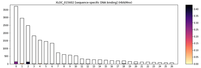
To alleviate this I am proposing an extension of dotplots: instead of circles, boxes, that have a height proportional to $log(#cells_{cluster})$, are filled proportionally to how many cells express gene $g$, and are colored according to the average expression.
I think this works better than violinplots. Sadly I see no good way to multiplex this and plot multiple genes at once. I am really interested in feedback - maybe I am overlooking something super simple/basic?
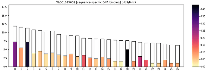
the corresponding dotplot:

The domino plot without log scale:
Contributor guide
First steps
- Read the whole issue, then the project's contributing guide.
- Comment on the issue to say you are picking it up — it saves two people doing the same work.
- Fork the repository and make your change on a branch.
- Open a pull request that references the issue number.
Research direction
The requested entry point is a new plotting function in scanpy’s sc.pl, extending the existing dotplot concept. Start by locating the current dotplot implementation and clarify the proposed box height, fill, and color encodings with maintainers; done means an agreed, implemented visualization that communicates cell counts and expression as described.
Written by the indexing model from the issue text.
Assessment
- Tech stack
- python
- Domain
- data-visualization
- Issue type
- Feature
- Difficulty
- 5/5
- Estimated time
- Over a week
- Activity status
- Stale
- Clarity
- Needs clarification
- Newbie friendliness
- 35/100