redpanda-data / redpanda-data/console
Data visualization on topics page
Nobody has claimed this yet.
- Dominant language
- TypeScript
- Stars
- 4.3k
- Forks
- 432
- Avg merge
- 3d 6h
- Merged PRs (30d)
- 40
Description
This is copied in from a slack conversation
Great to see Kowl part of Redpanda! It seems Kowl is using react and mobx in the front-end app. I have always chosen mobx over other global state management tools like redux since it has less boilerplate, has observable state, and can be used with anything (not just react).
Another visualization tool I like to use with react and mobx is D3. It would be awesome to have a visualization built-in to the topics dashboard similar to the mockup attached. X/Y axes and data points could be associated with the appropriate data either by selecting from incoming data values in the message tab, or maybe automatically from the topic's associated schema (on the schema registry page). The red/yellow lines could mean min/max (red) or something like confidence interval (yellow). They could also be for the same purpose as in the original chart, which is to show safe ranges (anything outside of red gets escalated in some way, like notifications via pagerduty etc.). For the market_activity topic the red/yellow lines could be market's high/low for the time period.
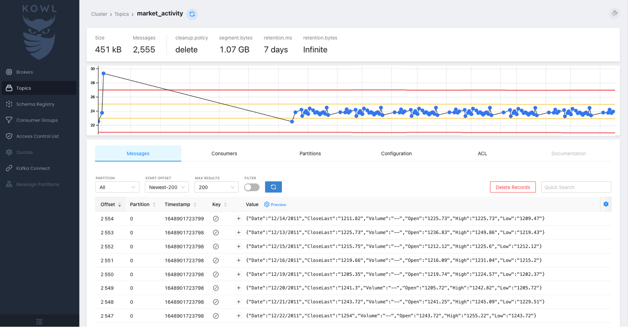
An older version of the D3/react/mobx chart I used as the basis of this mockup is in a gist here. I'll come up with a working project whenever I get a chance that includes this component along with react, mobx, and kowl.
Contributor guide
First steps
- Read the whole issue, then the project's contributing guide.
- Comment on the issue to say you are picking it up — it saves two people doing the same work.
- Fork the repository and make your change on a branch.
- Open a pull request that references the issue number.
Research direction
No implementation files or tests are named. Start by reviewing the topics dashboard and the linked D3 gist and mockup; done should be a built-in visualization with defined data selection or schema behavior, axes, data points, and agreed meanings for the red and yellow range lines.
Written by the indexing model from the issue text.
Assessment
- Tech stack
- d3, react
- Domain
- data-visualization, frontend
- Issue type
- Feature
- Difficulty
- 5/5
- Estimated time
- Over a week
- Activity status
- Stale
- Clarity
- Needs clarification
- Newbie friendliness
- 25/100