recloudstream / recloudstream/cloudstream
Some suggestion to enhance visual experience of current new UI
Open
Nobody has claimed this yet.
enhancement
- Dominant language
- Kotlin
- Stars
- 10.7k
- Forks
- 1.1k
- Avg merge
- 1d 23h
- Merged PRs (30d)
- 15
Description
Describe your suggested feature
1; Change initial loading animation matches to the final
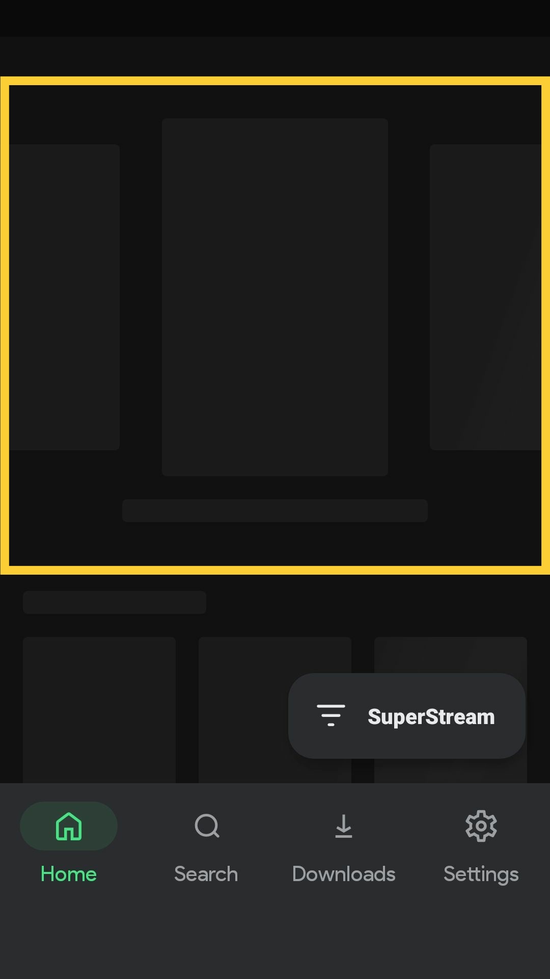
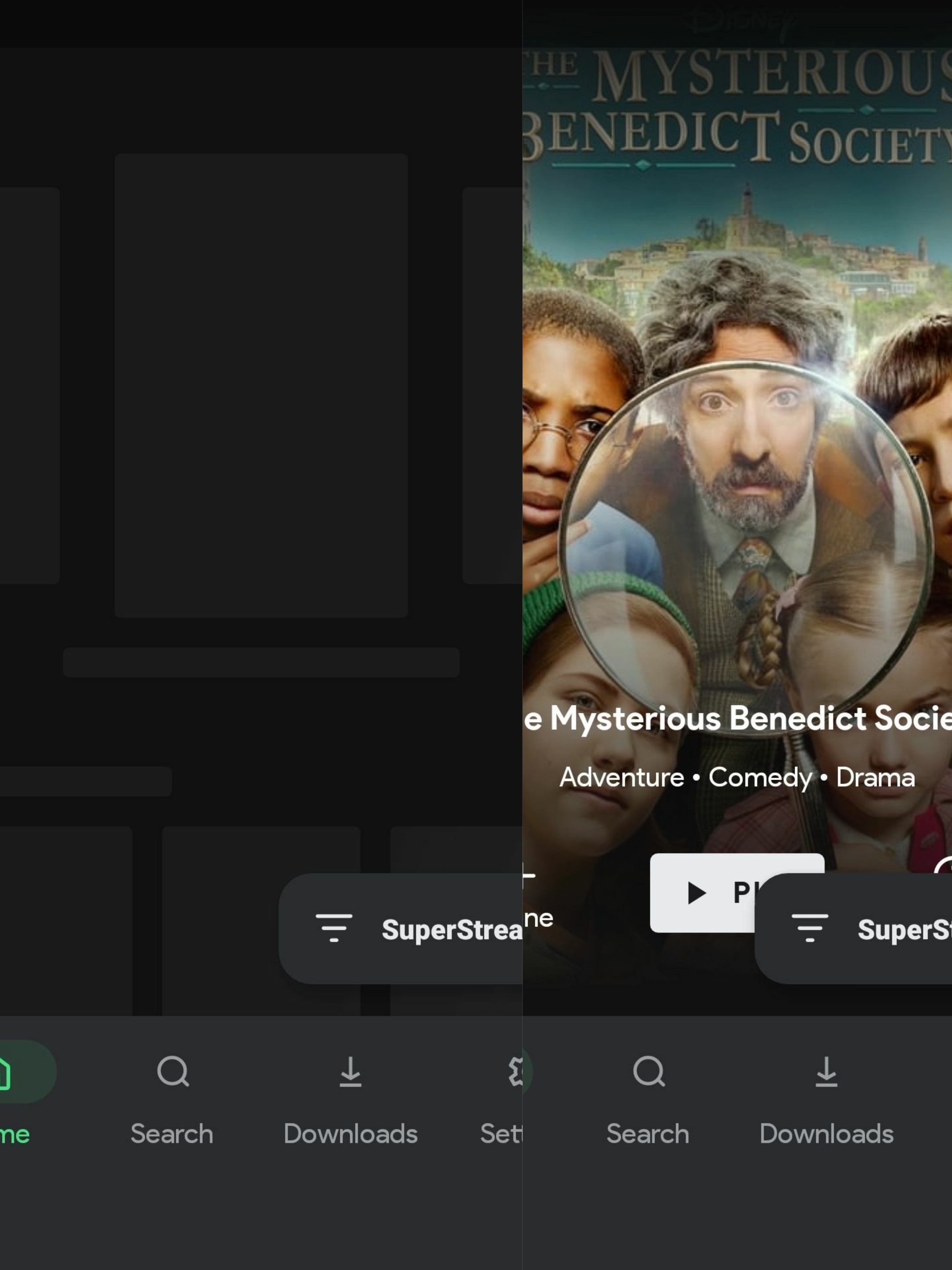
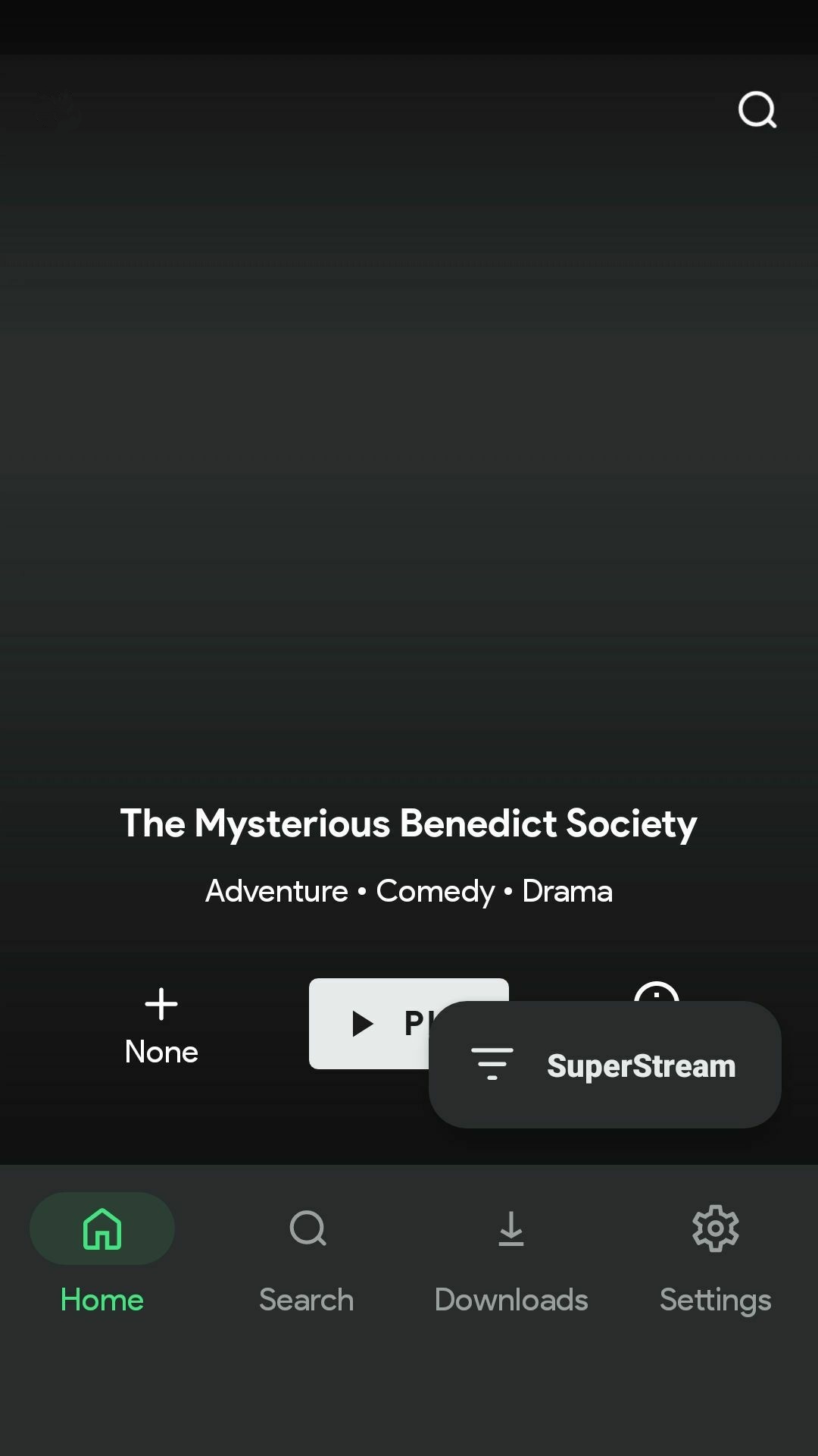
2; Change the position of the search button from left to right
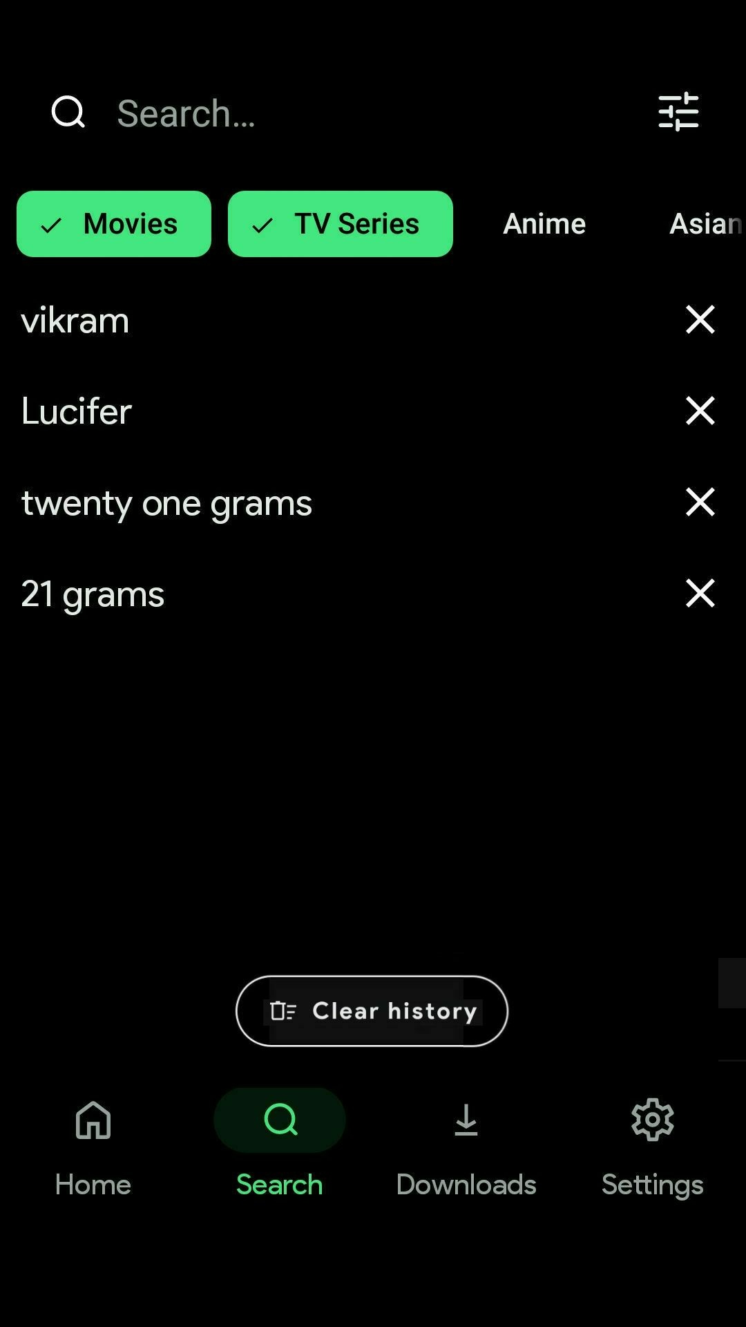
3; Change the current appearance of 'Clear history' like this👇
Other details
No response
Acknowledgements
- I have searched the existing issues and this is a new ticket, NOT a duplicate or related to another open issue.
- I have written a short but informative title.
- I will fill out all of the requested information in this form.
Contributor guide
No contributing guide indexed for this repository
First steps
- Read the whole issue, then the project's contributing guide.
- Comment on the issue to say you are picking it up — it saves two people doing the same work.
- Fork the repository and make your change on a branch.
- Open a pull request that references the issue number.
Research direction
Start by reviewing the three screenshots and locating the current new UI screens for initial loading, search, and Clear history in the Android app. Confirm the relevant UI entry points and compare each result with the requested visuals; done means all three proposed changes are implemented consistently.
Written by the indexing model from the issue text.
Assessment
- Tech stack
- kotlin
- Domain
- design, mobile
- Issue type
- Feature
- Difficulty
- 3/5
- Estimated time
- 1-2 days
- Activity status
- Stale
- Clarity
- Needs clarification
- Newbie friendliness
- 25/100