Dialogue boxes poor layout
Open
Nobody has claimed this yet.
- Dominant language
- Racket
- Stars
- 68
- Forks
- 82
- PR merge metrics
- No merged PRs in 30d
Description
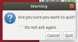
Proper whitespace needed. This is on Ubuntu 18.04. Visual layout should be to the same high standard as the underlying computer science. It matters for newbies.
Contributor guide
First steps
- Read the whole issue, then the project's contributing guide.
- Comment on the issue to say you are picking it up — it saves two people doing the same work.
- Fork the repository and make your change on a branch.
- Open a pull request that references the issue number.
Research direction
Start by reproducing the dialogue-box layout shown in the attached image on Ubuntu 18.04 and identify where whitespace and visual hierarchy fall short. Review the affected GUI dialogs and define the work as done when their layout reaches the project's expected visual standard and remains usable for newcomers.
Written by the indexing model from the issue text.
Assessment
- Tech stack
- ubuntu
- Domain
- design, desktop
- Issue type
- Bug
- Difficulty
- 4/5
- Estimated time
- 3-5 days
- Activity status
- Stale
- Clarity
- Needs clarification
- Newbie friendliness
- 35/100