pnp / pnp/sp-dev-fx-controls-react
ChartControl custom HorizontalBarChart
Nobody has claimed this yet.
- Dominant language
- TypeScript
- Stars
- 433
- Forks
- 418
- Avg merge
- 5d 6m
- Merged PRs (30d)
- 19
Description
Category
[ ] Enhancement
[ ] Bug
[X] Question
Version
spfx-controls-react: [3.10.0]
this version uses the Chart.js Version: [2.9.4]
Question
I am using the ChartControl and I need to create a HorizontalBar with rounded corners and some other customizations. My goal is to achiev something like this:

This is my code:
case ChartType.HorizontalBar:
                    return (
                        <ChartControl
                            plugins={[ChartDataLabels]}
                            loadingtemplate={() => <div>Please wait...</div>}
                            type={this.charttype}
                            data={{
                                labels: PollAnalytics.Labels,
                                datasets: [{
                                    //label: 'Results',
                                    //data: PollAnalytics.Labels,
                                    data: this.percentageValues,
                                    backgroundColor: [
                                        'rgba(255, 255, 255, 1)',
                                        'rgba(255, 255, 255, 1)',
                                        'rgba(255, 255, 255, 1)',
                                        'rgba(255, 255, 255, 1)',
                                        'rgba(255, 255, 255, 1)',
                                        'rgba(255, 255, 255, 1)',
                                        'rgba(255, 255, 255, 1)',
                                        'rgba(255, 255, 255, 1)',
                                        'rgba(255, 255, 255, 1)',
                                        'rgba(255, 255, 255, 1)'
                                    ],
                                    borderColor: [
                                        'rgba(51, 3, 0, 1)',
                                        'rgba(51, 3, 0, 1)',
                                        'rgba(51, 3, 0, 1)',
                                        'rgba(51, 3, 0, 1)',
                                        'rgba(51, 3, 0, 1)',
                                        'rgba(51, 3, 0, 1)',
                                        'rgba(51, 3, 0, 1)',
                                        'rgba(51, 3, 0, 1)',
                                        'rgba(51, 3, 0, 1)',
                                        'rgba(51, 3, 0, 1)'
                                    ],
                                    borderWidth: 1,
                                    borderSkipped: false,
                                    datalabels: {
                                        labels: {
                                            index: {
                                                align: 'start',
                                                anchor: 'end',
                                                color: '#333',
                                                font: {
                                                    weight: 'bold'
                                                },
                                                formatter: function (value: number, context: Context) {
                                                    console.log({context})
                                                    return value + " %";
                                                }
                                            },
                                            value: {
                                                align: 'end',
                                                anchor: 'start',
                                                color: '#333',
                                                formatter: function (value: number, context: Context) {
                                                    return context.chart.data.labels[context.dataIndex];
                                                }
                                            }
                                        },
                                    }
                                }]
                            }}
                            options={{
                                tooltips: {
                                    callbacks: {
                                        label: function (tooltipItem: any, data: any) {
                                            console.log({ tooltipItem })
                                            const label = PollAnalytics.PollResponse[tooltipItem.index] || '';
                                            console.log(label)
                                            return label;
                                        }
                                    }
                                },
                                scales: {
                                    yAxes: [{
                                        ticks: {
                                            display: false,
                                            beginAtZero: true,
                                            stepSize: 1,
                                        },
                                        display: false,
                                    }],
                                    xAxes: [{
                                        ticks: {
                                            callback: function (value: number, index: number) {
                                                return value + '%';
                                            },
                                            stepSize: 25,
                                            beginAtZero: true,
                                            min: 0,
                                            max: 100,
                                        },
                                        display: false
                                    }],
                                },
                                legend: {
                                    display: false
                                },
                            }}

                        />
                    );
                default:
                    break;
And this is my result:
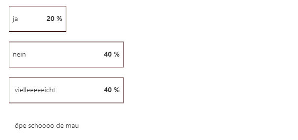
You can see, that with the plugin:
https://v1_0_0--chartjs-plugin-datalabels.netlify.app/
i already achieved to customize the labels. My problem is, i dont know how to make the following 3 things:
- Horizontal Bars always fixed full width/height
- rounded corners on Bars (cannot use borderRadius option, does not exist on this version)
- fill the bar with a color, matching the percentage value
Does anyboady has an answer? Thank you
Contributor guide
No contributing guide indexed for this repository
First steps
- Read the whole issue, then the project's contributing guide.
- Comment on the issue to say you are picking it up — it saves two people doing the same work.
- Fork the repository and make your change on a branch.
- Open a pull request that references the issue number.
Research direction
Start with the ChartControl configuration shown in the issue and the Chart.js 2.9.4 and chartjs-plugin-datalabels behavior it relies on. Done would require an agreed implementation for full-size horizontal bars, rounded corners without borderRadius, and percentage-based bar colors, but no repository file or test is identified.
Written by the indexing model from the issue text.
Assessment
- Tech stack
- typescript
- Domain
- frontend
- Issue type
- Feature
- Difficulty
- 5/5
- Estimated time
- Over a week
- Activity status
- Stale
- Clarity
- Needs clarification
- Newbie friendliness
- 20/100