Outer line addition to a scatterpolar plot
Open
Nobody has claimed this yet.
- Dominant language
- R
- Stars
- 2.7k
- Forks
- 641
- PR merge metrics
- No merged PRs in 30d
Description
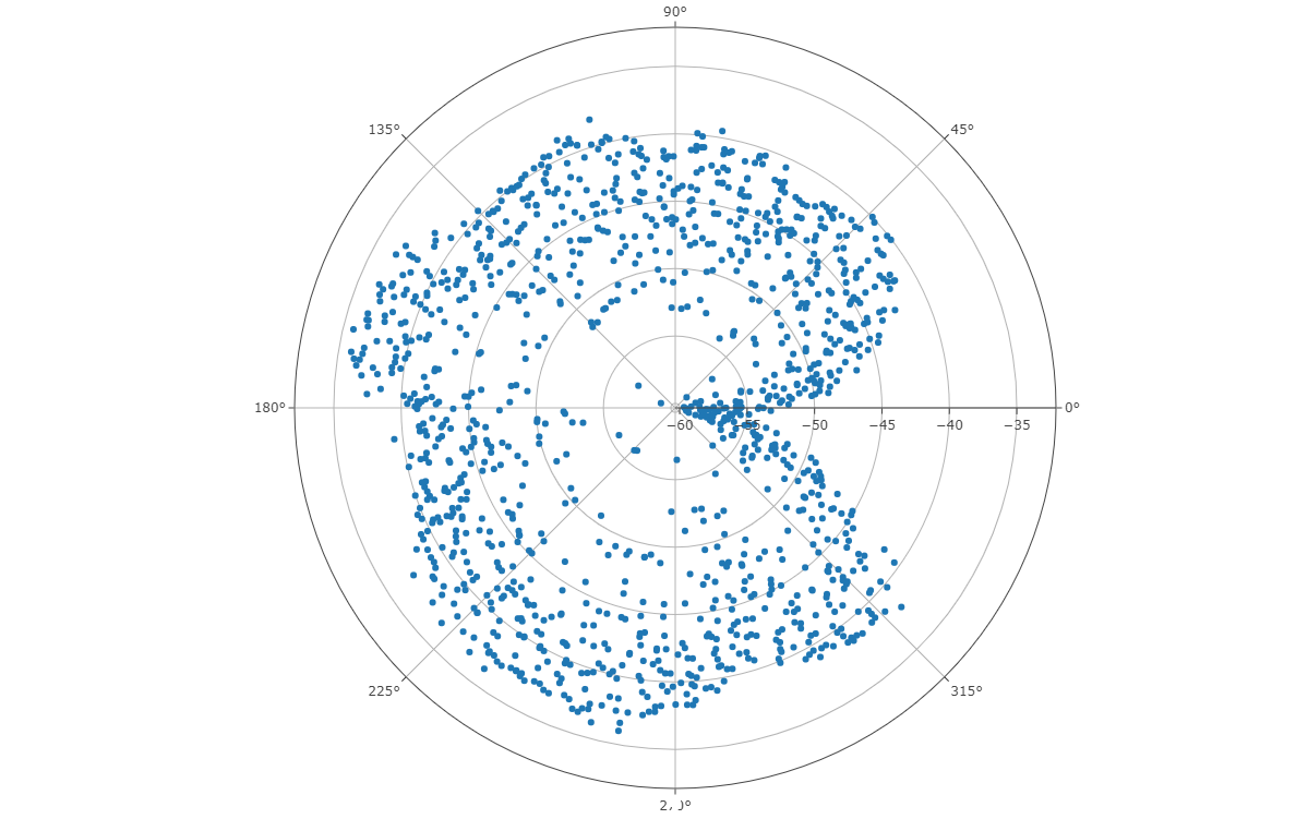
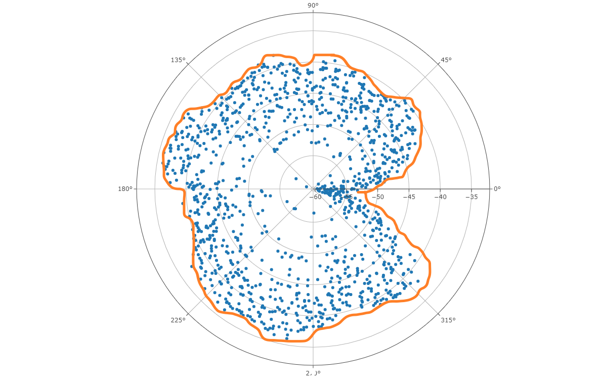
I have a really nice scatterpolar plot, but I would like to put a line around the outer maximum values of the scatter which would indicate the maximum value of each polar angle. I hand drew what I'm looking for in the second diagram
Contributor guide
First steps
- Read the whole issue, then the project's contributing guide.
- Comment on the issue to say you are picking it up — it saves two people doing the same work.
- Fork the repository and make your change on a branch.
- Open a pull request that references the issue number.
Research direction
The issue names scatterpolar plots and provides diagrams, but no files, tests, or entry points. Start by locating the scatterpolar implementation and existing examples, then determine how maximum values by polar angle should be represented. Done means the requested outer line is rendered correctly and covered by tests or an example.
Written by the indexing model from the issue text.
Assessment
- Tech stack
- r
- Domain
- data-visualization
- Issue type
- Feature
- Difficulty
- 5/5
- Estimated time
- Over a week
- Activity status
- Stale
- Clarity
- Needs clarification
- Newbie friendliness
- 30/100