share_xaxes in subplot prevents data from showing up
Nobody has claimed this yet.
- Dominant language
- Python
- Stars
- 24.4k
- Forks
- 2.3k
- Avg merge
- 2d 7h
- Merged PRs (30d)
- 13
Description
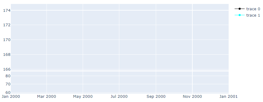
I am making subplot for my dash app. I am using make_subplot to show two plots in a column. I want them to share the x axis and with the window height 0.75:0.25. It worked fine with plot.ly fig.show(), however, when I put in into GCC.graph, the data is not showing up. When I remove share_xaxes=True, the data show up, but the two subplots do not react simultaneously (for example, when zoom in one, the other doesn't).
Here is the reproduceable code (I am using Jupyter Lab, therefore debug=False in the main):
import pandas as pd
columns=['Date','col1','col2', 'col3']
data={'row1':['2019-01-31',166.440, 73.417283, 59.702568],
'row2':['2019-02-01', 166.520, 73.530398, 59.782428],
'row3':['2019-02-04', 171.250, 79.536789, 64.288669],
'row4':['2019-02-05', 174.179, 82.418937, 66.771527],
'row5':['2019-02-06', 174.240, 82.478897, 66.823261],
'row6':['2019-02-07', 170.940, 67.869795, 61.266096],
'row7':['2019-02-08', 170.410, 65.689645, 60.397355],
'row8':['2019-02-11', 169.429, 61.428562, 58.737154],
'row9':['2019-02-12', 170.889, 65.333093, 60.478345],
'row10':['2019-02-13', 170.179, 61.784665, 59.170717]}

df=pd.DataFrame.from_dict(data, orient='index')
df.columns = columns

import plotly.graph_objs as go
from plotly.subplots import make_subplots

import dash
import dash_core_components as dcc
import dash_html_components as html
from dash.dependencies import Input, Output

app = dash.Dash(__name__)

app.layout = html.Div([
    html.Div([
            dcc.Checklist(
                id='variables',
                values='value')
        ]),
    dcc.Graph(id='chart', figure={})
])

@app.callback(
    Output(component_id='chart', component_property='figure'), #],
    [Input('variables','values')])
def update_graph(variable):

    fig = make_subplots(rows=2, cols=1, row_heights = [0.75, 0.25], vertical_spacing=0.01, subplot_titles=(' ', ''), shared_xaxes=True)

    fig.add_trace(go.Scatter(x=df.Date,
                        y=df['col1'], line_color='black', line_width = 1), row = 1, col = 1)
    fig.add_trace(go.Scatter(x = df.Date,
                        y = df['col2'], line_color='cyan', line_width = 1), row = 2, col =1)

    return fig

# -------------------------------------------------- ----------------------------
if __name__ == '__main__':
    app.run_server(debug=False)
----- Here are the versions:
dash                          2.0.0
dash-core-components          2.0.0
dash-html-components          2.0.0
dash-renderer                 0.20.0
dash-table                    5.0.0
- OS: Windows 10 Home
- Browser: chrome 96.0.4664.45
Wrong behavior
Expected behavior

Contributor guide
First steps
- Read the whole issue, then the project's contributing guide.
- Comment on the issue to say you are picking it up — it saves two people doing the same work.
- Fork the repository and make your change on a branch.
- Open a pull request that references the issue number.
Research direction
Start with the reproducible Dash app using make_subplots and dcc.Graph, then compare its shared-x-axis figure with the same figure rendered by fig.show(). Trace why the two traces disappear when shared_xaxes=True; done when both subplots render in dcc.Graph and zooming one synchronizes the other.
Written by the indexing model from the issue text.
Assessment
- Tech stack
- plotly, python
- Domain
- data-visualization
- Issue type
- Bug
- Difficulty
- 3/5
- Estimated time
- 1-2 days
- Activity status
- Stale
- Clarity
- Clearly specified
- Newbie friendliness
- 48/100