[feature request] add dcc.Dropdown options grouping
Nobody has claimed this yet.
- Dominant language
- Python
- Stars
- 24.4k
- Forks
- 2.3k
- Avg merge
- 2d 7h
- Merged PRs (30d)
- 13
Description
It seems that dcc.Dropdown currently doesn't support optgroups.
from dash import Dash
import dash_html_components as html
import dash_core_components as dcc

app = Dash(__name__)
app.layout = dcc.Dropdown(
    id="dropdown",
    options=[
        {
            "label": "Group 1",
            "options": [
                {"label": "Group 1, option 1", "value": "value_1"},
                {"label": "Group 1, option 2", "value": "value_2"},
            ],
        },
        {
            "label": "Group 2",
            "options": [
                {"label": "Group 2, option 1", "value": "value_3"},
                {"label": "Group 2, option 2", "value": "value_4"},
            ],
        },
        {
            "label": "Group 3",
            "options": [
                {"label": "Group 3, option 1", "value": "value_5"},
                {"label": "Group 3, option 2", "value": "value_6"},
            ],
        },
    ],
    value="NYC",
)

if __name__ == "__main__":
    app.run_server(debug=True)

I think the only problem here is changing the proptypes so they allow these types of options to be pased in as react-select
does support this syntax.
As a workaround for my use-case I've made my own wrapper component using dash-component-boilerplate and that works for me, but I think it would be nice if this was built-in behavior of dcc.Dropdown.
My working wrapper component
import React from "react";
import "../styles/sideBar.css";
import Select from 'react-select'

export default class SelectWrapper extends React.Component {
  constructor(props) {
    super(props);
    this.state = {
      value: this.props.options[0]
    };
    this.handleChange = this.handleChange.bind(this);
  }

  handleChange = selectedOption => {
    this.props.setProps({ value: selectedOption.value });
    this.setState({ value: selectedOption });
  };

  render() {
    return <Select {...this.props} onChange={this.handleChange} value={this.props.value} />
  }
}

SelectWrapper.defaultProps = {
    clearable: true,
    disabled: false,
    multi: false,
    searchable: true,
    optionHeight: 35,
    persisted_props: ['value'],
    persistence_type: 'local',
};

SelectWrapper.propTypes = {
  /**
   * Select options
   */
  options: PropTypes.array,

  /**
   * The value of the input. If `multi` is false (the default)
   * then value is just a string that corresponds to the values
   * provided in the `options` property. If `multi` is true, then
   * multiple values can be selected at once, and `value` is an
   * array of items with values corresponding to those in the
   * `options` prop.
   */
  value: PropTypes.oneOfType([
      PropTypes.string,
      PropTypes.number,
      PropTypes.bool,
      PropTypes.arrayOf(
          PropTypes.oneOfType([
              PropTypes.string,
              PropTypes.number,
              PropTypes.bool,
          ])
      ),
  ]),

  /**
   * The ID of this component, used to identify dash components
   * in callbacks. The ID needs to be unique across all of the
   * components in an app.
   */
  id: PropTypes.string,

  /**
   * height of each option. Can be increased when label lengths would wrap around
   */
  optionHeight: PropTypes.number,

  /**
   * className of the dropdown element
   */
  className: PropTypes.string,

  /**
   * Whether or not the dropdown is "clearable", that is, whether or
   * not a small "x" appears on the right of the dropdown that removes
   * the selected value.
   */
  clearable: PropTypes.bool,

  /**
   * If true, this dropdown is disabled and the selection cannot be changed.
   */
  disabled: PropTypes.bool,

  /**
   * If true, the user can select multiple values
   */
  multi: PropTypes.bool,

  /**
   * The grey, default text shown when no option is selected
   */
  placeholder: PropTypes.string,

  /**
   * Whether to enable the searching feature or not
   */
  searchable: PropTypes.bool,

  /**
   * The value typed in the DropDown for searching.
   */
  search_value: PropTypes.string,

  /**
   * Dash-assigned callback that gets fired when the input changes
   */
  setProps: PropTypes.func,

  /**
   * Defines CSS styles which will override styles previously set.
   */
  style: PropTypes.object,

  /**
   * Object that holds the loading state object coming from dash-renderer
   */
  loading_state: PropTypes.shape({
      /**
       * Determines if the component is loading or not
       */
      is_loading: PropTypes.bool,
      /**
       * Holds which property is loading
       */
      prop_name: PropTypes.string,
      /**
       * Holds the name of the component that is loading
       */
      component_name: PropTypes.string,
  }),

  /**
   * Used to allow user interactions in this component to be persisted when
   * the component - or the page - is refreshed. If `persisted` is truthy and
   * hasn't changed from its previous value, a `value` that the user has
   * changed while using the app will keep that change, as long as
   * the new `value` also matches what was given originally.
   * Used in conjunction with `persistence_type`.
   */
  persistence: PropTypes.oneOfType([
      PropTypes.bool,
      PropTypes.string,
      PropTypes.number,
  ]),

  /**
   * Properties whose user interactions will persist after refreshing the
   * component or the page. Since only `value` is allowed this prop can
   * normally be ignored.
   */
  persisted_props: PropTypes.arrayOf(PropTypes.oneOf(['value'])),

  /**
   * Where persisted user changes will be stored:
   * memory: only kept in memory, reset on page refresh.
   * local: window.localStorage, data is kept after the browser quit.
   * session: window.sessionStorage, data is cleared once the browser quit.
   */
  persistence_type: PropTypes.oneOf(['local', 'session', 'memory']),
};
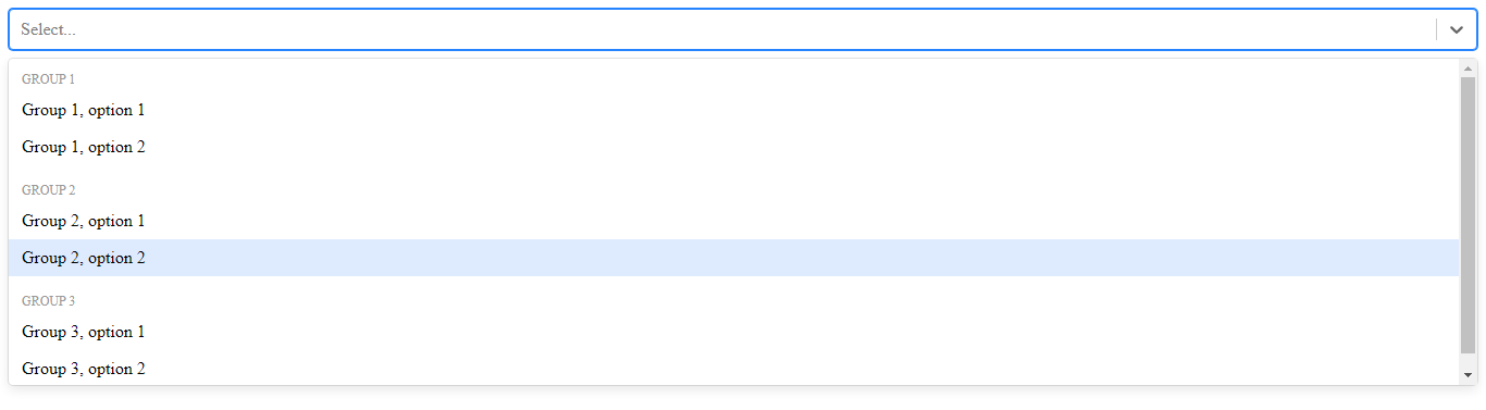
Looks like this when used
Contributor guide
First steps
- Read the whole issue, then the project's contributing guide.
- Comment on the issue to say you are picking it up — it saves two people doing the same work.
- Fork the repository and make your change on a branch.
- Open a pull request that references the issue number.
Research direction
Start at dcc.Dropdown and compare its options prop validation with react-select's grouped-options syntax. Use the supplied wrapper and example as the behavioral reference; done means grouped options are accepted and rendered by dcc.Dropdown without the current prop-type error.
Written by the indexing model from the issue text.
Assessment
- Tech stack
- javascript, python, react
- Domain
- frontend
- Issue type
- Feature
- Difficulty
- 4/5
- Estimated time
- 3-5 days
- Activity status
- Active
- Clarity
- Mostly clear
- Newbie friendliness
- 55/100