px.scatter_geo component: animation frame does not show the colors according to every available year, it just shows the colors according to the first selected year.
Nobody has claimed this yet.
- Dominant language
- Python
- Stars
- 24.4k
- Forks
- 2.3k
- Avg merge
- 2d 7h
- Merged PRs (30d)
- 13
Description
Describe your context
Please provide us your environment so we can easily reproduce the issue.
dash                 1.10.0
dash-core-components 1.9.0
dash-html-components 1.0.3
dash-renderer        1.3.0
dash-table           4.6.2
-
if frontend related, tell us your Browser, Version and OS
- OS: Ubuntu 16.04 LTS
- Browser: Firefox
- Version: 75.0 (64-bit)
Describe the bug
I'm trying to create a Bubble Map with animation, as described here, and I believe I've found a little bug that I would like to warn you all.
I have the following data frame (e.g. df.head()):
| amount | dataset | date | longitude | latitude | year | |
|---|---|---|---|---|---|---|
| 0 | 10 | CBERS4_AWFI_L4_SR | 2016-05-01 | -47.5 | -4.5 | 2016 |
| 1 | 12 | CBERS4_AWFI_L4_SR | 2016-05-02 | -39.0 | -4.5 | 2016 |
| 2 | 6 | CBERS4_AWFI_L4_SR | 2016-05-03 | -54.0 | 1.0 | 2016 |
| 3 | 10 | CBERS4_AWFI_L4_SR | 2016-05-04 | -46.5 | -4.5 | 2016 |
| 4 | 13 | CBERS4_AWFI_L4_SR | 2016-05-05 | -38.0 | -4.5 | 2016 |
Where dataset is a category and I have 13 types of datasets.
I would like to create a Bubble Map with animation frame in order to represent my data. I've created one, but, for some reason, the animation frame does not show all my datasets according to the selected year.
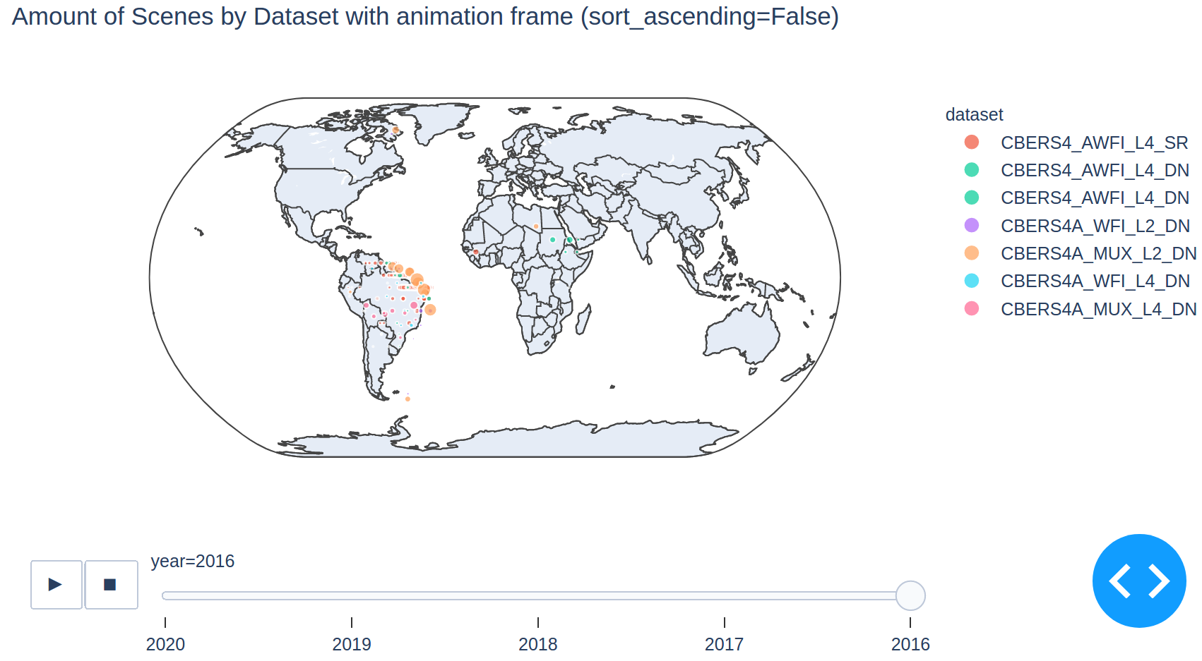
I have the following available years to my animation frame: [2016, 2017, 2018, 2019, 2020]. If I create the animation frame in ascending order, just 2 datasets are shown during all the animation, while if I create it in descending order, just 7 datasets are shown, during all the animation. No matter which order I choose, the animation frame does not show all the available datasets, with the exception of the first selected year.
For example: the first year (i.e. 2016) has just 2 datasets, then the animation frame fixed the amount of datasets related to this year (i.e. 2) and it uses this number to show the datasets of the other years. Then, when the animation frame goes to the next year (e.g. 2017) that has 6 datasets, the animation frame does not show all the 6 datasets, it shows just 2 datasets according to the first year, and so on.
One thing I've asked to myself is: if I have only 2 datasets in 2016, how are shown 7 datasets in 2016 when I use descending order? Because of that, I believe this would be an unexpected behavior to this component.
Expected behavior
I believe the expected behavior would be the number of datasets increase or decrease on the right menu and on the map according to amount inside the data frame and do not leave a fixed number.
For example: if I have 2 datasets in 2016, then the animation frame should show 2 datasets to this year; if I have 6 datasets in 2017, then the animation frame should show 6 datasets to this year; if I have 3 datasets in 2018, then the animation frame should show 3 datasets to this year; and so on.
Reproducible example
A reproducible example can be found here. I've created this branch from an application I'm starting developing. The steps to run the application are described inside the README.md file. This branch does not need database connection, then set the environment variables is not necessary, in other words, the step set -a && source dash.env && set +a is not needed to run.
Screenshots
Ascending order:
When the first year is 2016, the datasets related to this year that are shown on the right menu are correct.

However when I choose 2019 on the animation frame, that has 11 datasets, just 2 are shown again.

Descending order:
When the last year is 2016, the datasets that are related to this year are not shown on the right menu. Just the first two datasets exist to this year, indeed. The other shown datasets do not exist to this year.
Contributor guide
First steps
- Read the whole issue, then the project's contributing guide.
- Comment on the issue to say you are picking it up — it saves two people doing the same work.
- Fork the repository and make your change on a branch.
- Open a pull request that references the issue number.
Research direction
Start with the linked reproducible example and its README.md to run the Dash application without a database connection. Inspect the px.scatter_geo animation-frame behavior across the listed years and compare the datasets shown in each frame with the source data. Done means each year displays its own complete set of datasets in the map and right-side controls.
Written by the indexing model from the issue text.
Assessment
- Tech stack
- python
- Domain
- data-visualization
- Issue type
- Bug
- Difficulty
- 4/5
- Estimated time
- 3-5 days
- Activity status
- Stale
- Clarity
- Mostly clear
- Newbie friendliness
- 38/100