parcel-bundler / parcel-bundler/lightningcss
Support `@media` nesting
Open
Nobody has claimed this yet.
area: transpilation
- Dominant language
- Rust
- Stars
- 7.7k
- Forks
- 302
- PR merge metrics
- No merged PRs in 30d
Description
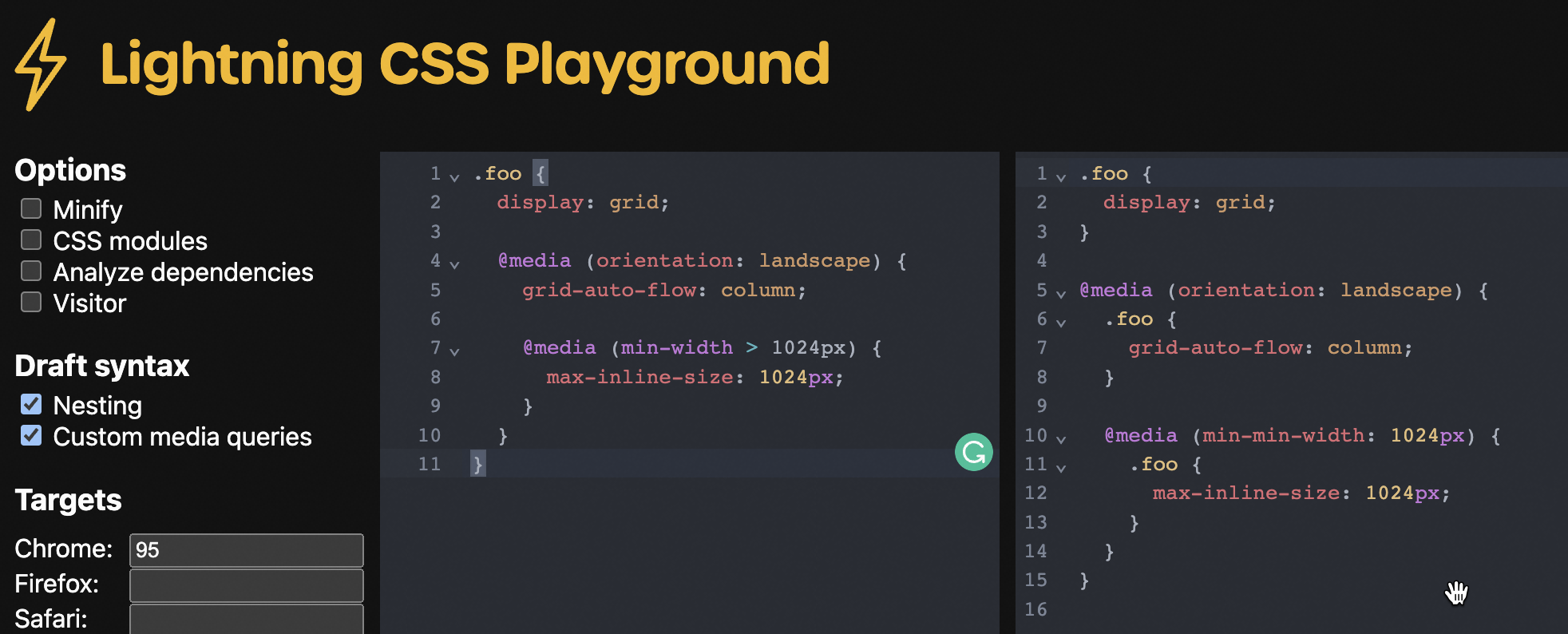
Spec: https://drafts.csswg.org/css-nesting-1/#conditionals
.foo {
  display: grid;

  @media (orientation: landscape) {
    grid-auto-flow: column;

    @media (min-width > 1024px) {
      max-inline-size: 1024px;
    }
  }
}

/* equivalent to */
  .foo { display: grid; }

  @media (orientation: landscape) {
    .foo {
      grid-auto-flow: column;
    }
  }

  @media (orientation: landscape) and (min-width > 1024px) {
    .foo {
      max-inline-size: 1024px;
    }
  }
Contributor guide
First steps
- Read the whole issue, then the project's contributing guide.
- Comment on the issue to say you are picking it up — it saves two people doing the same work.
- Fork the repository and make your change on a branch.
- Open a pull request that references the issue number.
Research direction
Read the linked CSS Nesting Level 1 specification and compare its conditional examples with the requested equivalence. Then inspect lightningcss's parser and compiler entry points to locate existing nesting and @media handling. Done means nested @media rules are transformed into the equivalent conditional rules shown in the issue, with coverage for nested conditions.
Written by the indexing model from the issue text.
Assessment
- Tech stack
- css, rust
- Domain
- compilers, web-dev
- Issue type
- Feature
- Difficulty
- 4/5
- Estimated time
- 3-5 days
- Activity status
- Stale
- Clarity
- Mostly clear
- Newbie friendliness
- 35/100