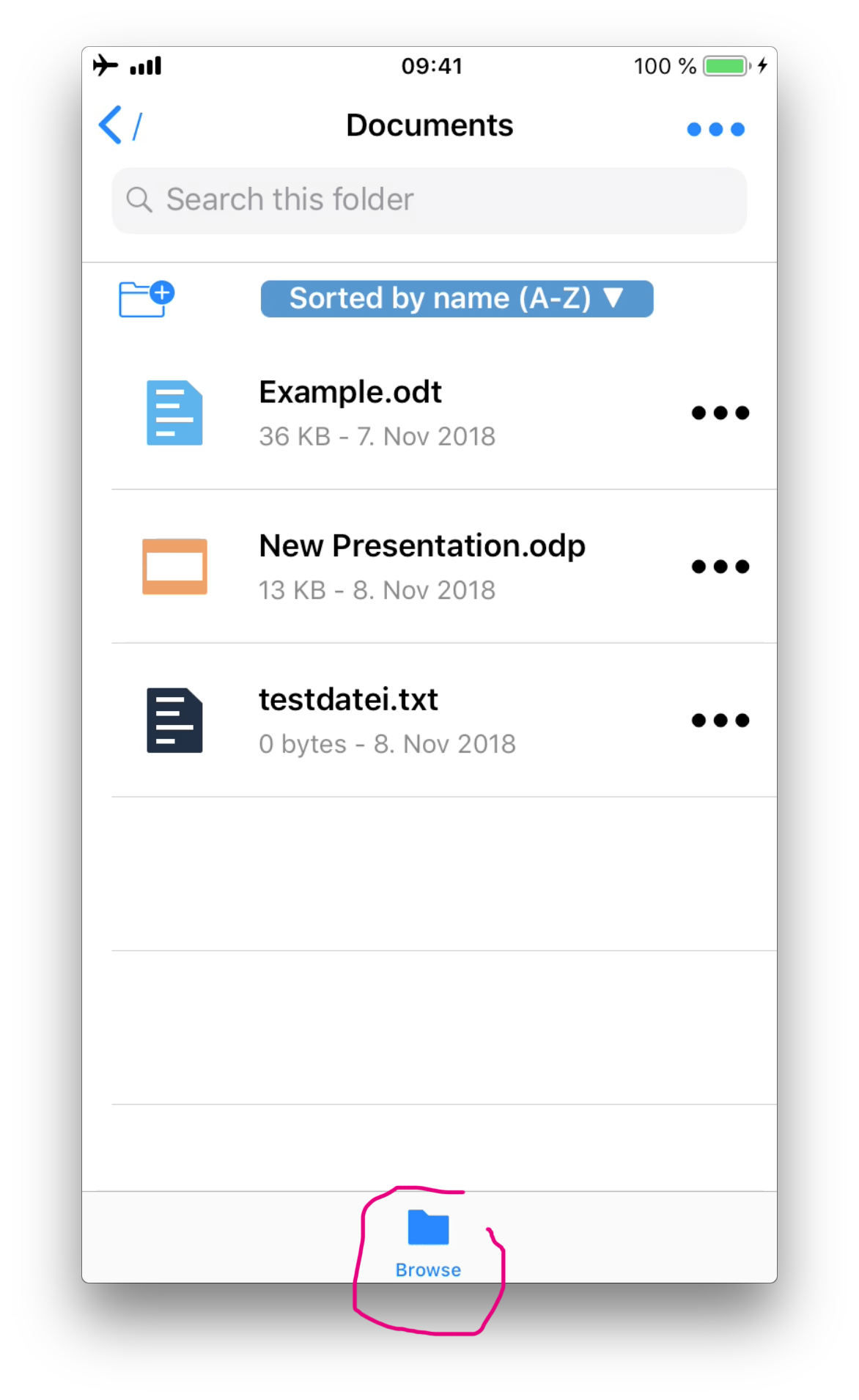
iOS Browse Button in bottom bar
Nobody has claimed this yet.
- Dominant language
- Swift
- Stars
- 251
- Forks
- 142
- Avg merge
- 2d 17h
- Merged PRs (30d)
- 3
Description
Steps to reproduce
1.	Start ownCloud Application
2.	Watch first screen
Expected behaviour
The Browse Button should be recognizable as a home button
Actual behaviour
The »Browse« Button in the bottom bar is confusing in many ways. It links to the »home screen« of the current ownCloud and therefore should be named as »home« or »root directory«. It’s also confusing because it never changes its state, it’s always blue, so the user sees no difference if he’s already in the home screen or a subfolder. As there are no other items in the bottom bar the position or need of this button should be questioned, it looks like a tab navigation component but doesn’t work like this.
Client
iOS version:
12.0.1
ownCloud app version:
1.0 build 85
Device model:
iPhone 7
Screenshot:
Contributor guide
First steps
- Read the whole issue, then the project's contributing guide.
- Comment on the issue to say you are picking it up — it saves two people doing the same work.
- Fork the repository and make your change on a branch.
- Open a pull request that references the issue number.
Research direction
Start at the app’s first screen and the bottom-bar Browse control, using the reproduction steps and screenshot to trace its navigation behavior. Define whether the control should be renamed, made stateful, repositioned, or removed, then verify the resulting home or root-directory navigation and selected-state behavior.
Written by the indexing model from the issue text.
Assessment
- Tech stack
- ios, swift
- Domain
- design, mobile
- Issue type
- Feature
- Difficulty
- 4/5
- Estimated time
- 3-5 days
- Activity status
- Stale
- Clarity
- Mostly clear
- Newbie friendliness
- 35/100