Settings in three different corners of the UI
Nobody has claimed this yet.
- Dominant language
- PHP
- Stars
- 8.8k
- Forks
- 2.1k
- Avg merge
- 20h 7m
- Merged PRs (30d)
- 41
Description
Seen in 10.9.0 RC2 - (not a regression, this is unchanged since ownCloud version 3 according to Holger)
- Open the clasic files Web UI
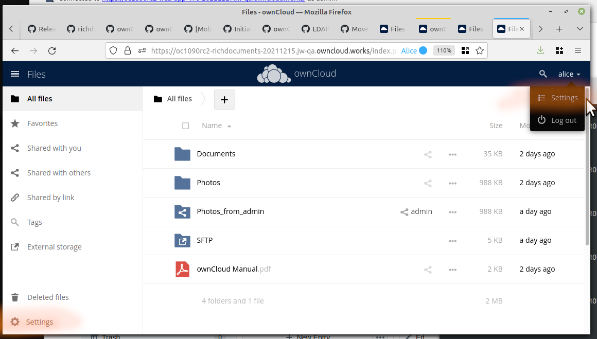
- The main settings pages are available under the user name in the top right corner. OK
- There is also a smaller Settings menu in the lower left corner. (Both highlighted in red)
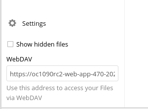
The menu in the lower left has normally only one setting and one information:
The new Web UI does not have the lower left settings at all. Thus these two items will not be available any more.
I suggest the following enhancement:
- Both items from the lower left should be integrated into the user's personal settings page. Mockup idea:
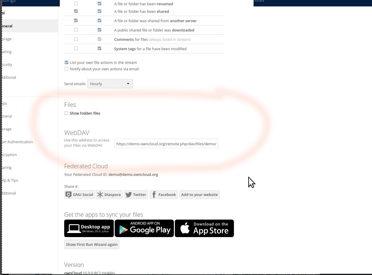
- The lower left settings box should be reduced to
[ ] show hidden files (or not even that ...)
[Visit your personal settings] (link to that)
Contributor guide
First steps
- Read the whole issue, then the project's contributing guide.
- Comment on the issue to say you are picking it up — it saves two people doing the same work.
- Fork the repository and make your change on a branch.
- Open a pull request that references the issue number.
Research direction
Start by comparing the classic Files Web UI's lower-left settings menu with the new Web UI and the personal settings page. Trace where the two lower-left items are currently provided, then verify the intended placement and reduced menu behavior against the mockups; done means both items remain available in the personal settings flow.
Written by the indexing model from the issue text.
Assessment
- Tech stack
- javascript, php
- Domain
- frontend, web-dev
- Issue type
- Feature
- Difficulty
- 4/5
- Estimated time
- 3-5 days
- Activity status
- Stale
- Clarity
- Mostly clear
- Newbie friendliness
- 35/100