openedx / openedx/docs.openedx.org
Make the version picker bigger and more obvious
Nobody has claimed this yet.
- Dominant language
- JavaScript
- Stars
- 35
- Forks
- 95
- Avg merge
- 5d 15h
- Merged PRs (30d)
- 3
Description
The version picker is hidden down in the bottom left of the screen:
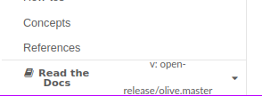
It is awesome that users can browse specific version of the docs, but it would be easy for a user to miss that they're looking at the docs for Olive vs Palm vs main.
Can we do anything to make that more conspicuous?
For historic context: The release process for the old documentation site involved changing the titles of book to indicate their version (e.g., Installing and Running: Juniper). That made the version obvious, but it's extra work for the release manager, so ideally on the new site we could just rely on the version picker.
Contributor guide
First steps
- Read the whole issue, then the project's contributing guide.
- Comment on the issue to say you are picking it up — it saves two people doing the same work.
- Fork the repository and make your change on a branch.
- Open a pull request that references the issue number.
Research direction
The issue provides a screenshot of the current version picker but names no files, tests, or entry points. Start by locating the documentation site's version-picker UI, then determine how to make the selected documentation version conspicuous; done means users can readily distinguish Olive, Palm, and main without changing book titles.
Written by the indexing model from the issue text.
Assessment
- Tech stack
- javascript
- Domain
- documentation
- Issue type
- Feature
- Difficulty
- 5/5
- Estimated time
- Over a week
- Activity status
- Stale
- Clarity
- Needs clarification
- Newbie friendliness
- 25/100