Add a geographic visualization/animation representing OONI probe activity
Open
Nobody has claimed this yet.
design
feature
help wanted
- Dominant language
- JavaScript
- Stars
- 92
- Forks
- 45
- PR merge metrics
- No merged PRs in 30d
Description
We should explore the idea of adding a visualization that captures the global nature of the data OONI probes collect.
If not based on realtime data, this could also be just an animation created using real data and timestamps.
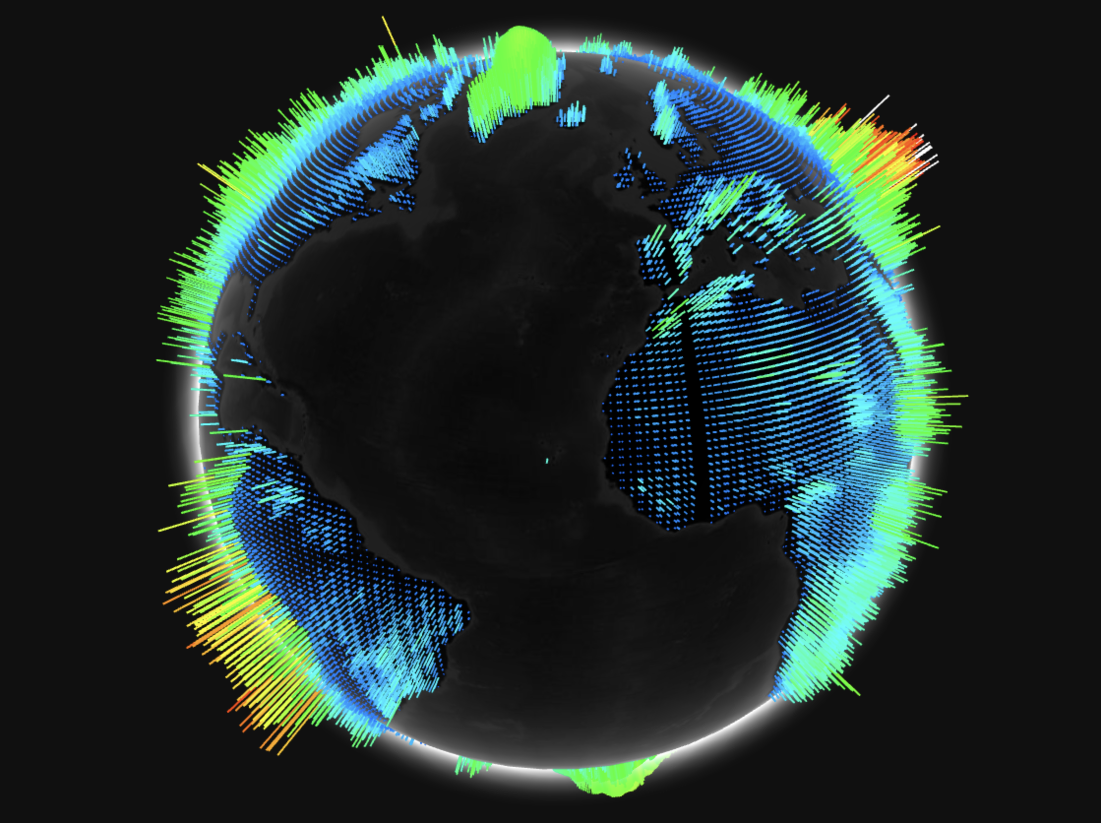
An earlier iteration of the project had an interactive globe that showed some data, which looked similar to this.
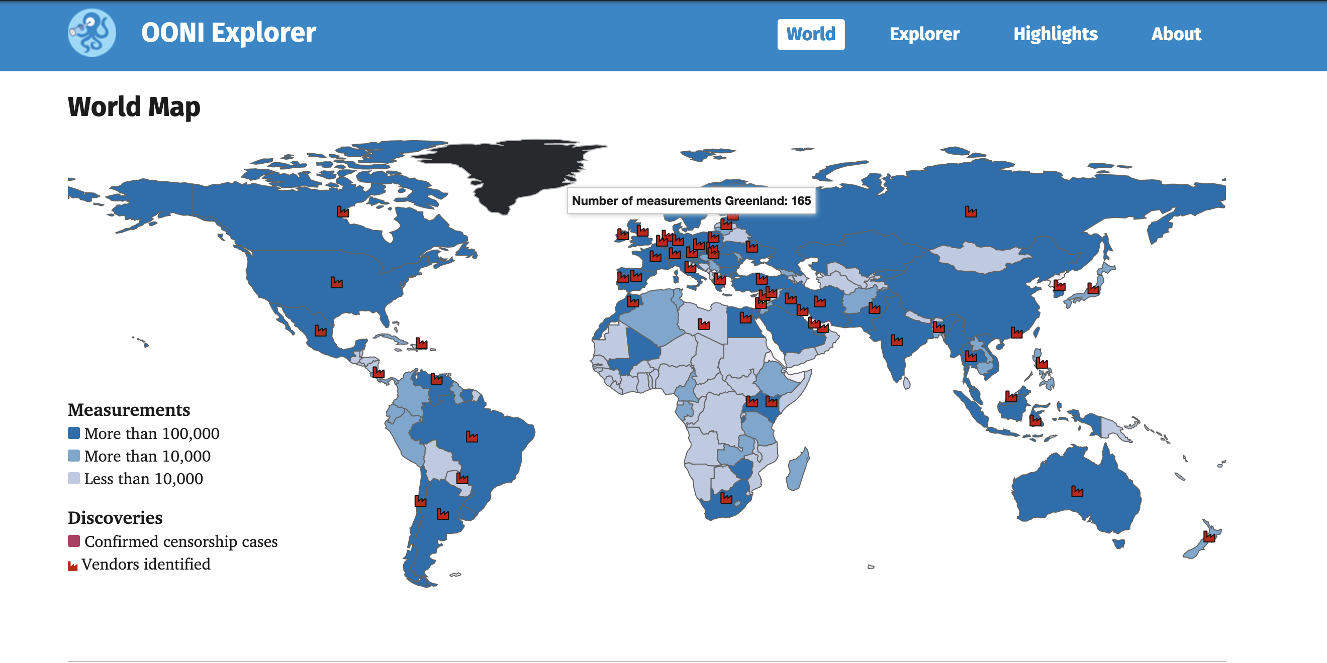
The older version of OONI Explorer had a world map visualizing the number of measurements collected per country.
Contributor guide
No contributing guide indexed for this repository
First steps
- Read the whole issue, then the project's contributing guide.
- Comment on the issue to say you are picking it up — it saves two people doing the same work.
- Fork the repository and make your change on a branch.
- Open a pull request that references the issue number.
Assessment
This issue has not been assessed yet.