observablehq / observablehq/plot
Chart cell improvements: add "label" encoding
Open
Nobody has claimed this yet.
- Dominant language
- HTML
- Stars
- 5.4k
- Forks
- 244
- PR merge metrics
- No merged PRs in 30d
Description
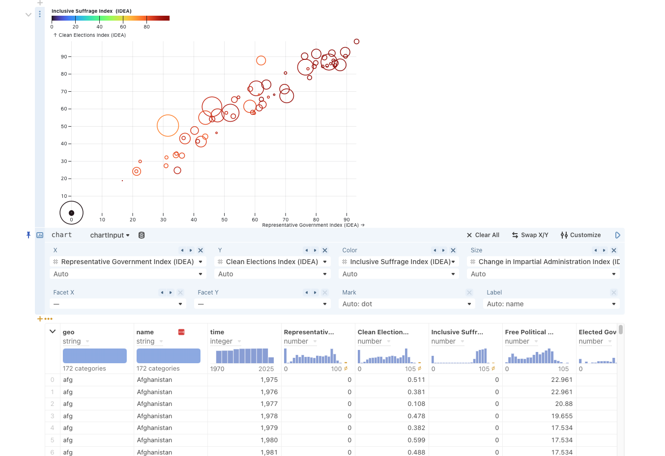
Would be useful to know what different marks represent when using the Chart cell
The desired outcome is in a fake screenshot below
Contributor guide
First steps
- Read the whole issue, then the project's contributing guide.
- Comment on the issue to say you are picking it up — it saves two people doing the same work.
- Fork the repository and make your change on a branch.
- Open a pull request that references the issue number.
Research direction
Start by tracing the Chart cell implementation and how its current encodings are mapped to marks. Use the linked screenshot as the expected behavior; done means a label encoding can identify what different marks represent in the rendered chart.
Written by the indexing model from the issue text.
Assessment
- Tech stack
- html
- Domain
- data-visualization
- Issue type
- Feature
- Difficulty
- 4/5
- Estimated time
- 3-5 days
- Activity status
- Stale
- Clarity
- Mostly clear
- Newbie friendliness
- 35/100