Right side menu should have indentations per levels
Nobody has claimed this yet.
- Dominant language
- Dockerfile
- Stars
- 600
- Forks
- 158
- Avg merge
- 16h 8m
- Merged PRs (30d)
- 21
Description
The right hand context aware menu could have indentation to make it easier to see which level it refers to.
Example:
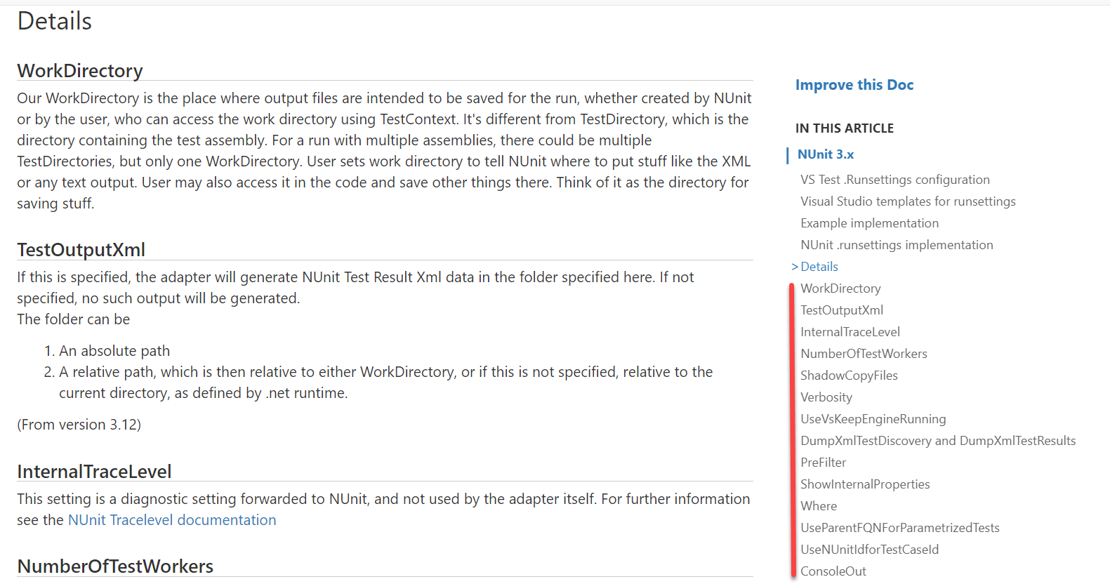
There is a lot of sub-items, and they are listed at the same indentation as the major Details.
If the subitems had been indented it would be easier to see how they belonged.
Now, there is the > mark there, so you sort of see it, but when the list go long, then you don't know which is the next major level item.
Contributor guide
First steps
- Read the whole issue, then the project's contributing guide.
- Comment on the issue to say you are picking it up — it saves two people doing the same work.
- Fork the repository and make your change on a branch.
- Open a pull request that references the issue number.
Research direction
Locate the right-hand context-aware menu in the documentation site and compare its current hierarchy with the example image in the issue. The work is done when sub-items are visibly indented beneath their major menu levels and long lists are easier to scan.
Written by the indexing model from the issue text.
Assessment
- Domain
- documentation
- Issue type
- Feature
- Difficulty
- 3/5
- Estimated time
- 1-2 days
- Activity status
- Stale
- Clarity
- Mostly clear
- Newbie friendliness
- 45/100