Update sidebar style
Nobody has claimed this yet.
- Dominant language
- PHP
- Stars
- 2.2k
- Forks
- 587
- Avg merge
- 18h 27m
- Merged PRs (30d)
- 333
Description
Now that we've removed the conversation title from the right sidebar we have a bit of a mess going on in the upper part of it:
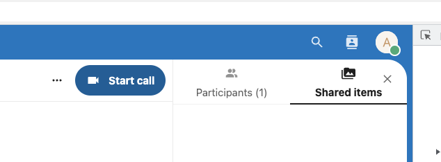
I would propose to use the icons that we already have in the top-bar as tabbing system for the specific content in the sidebar and also use them to toggle the sidebar on and off. Something along these lines.
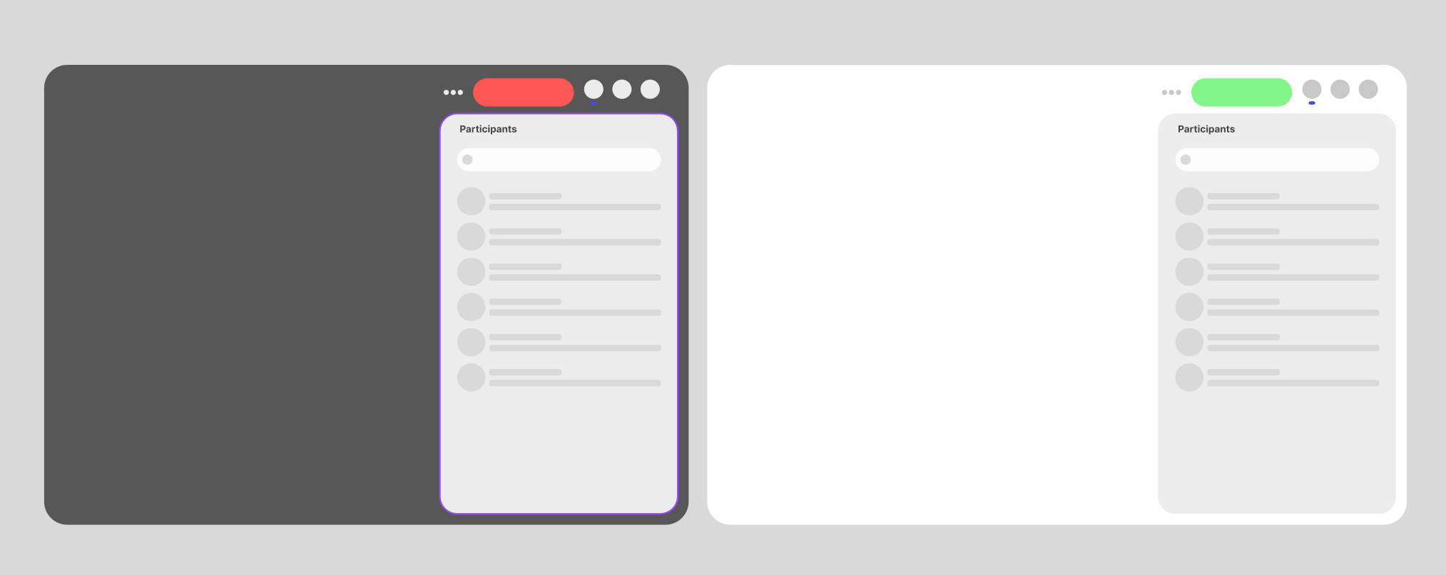
This would be in line with what teams and zoom are doing, so it's also what most people are used to.
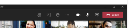
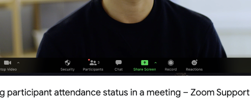
What do y'all think? @nimishavijay @jancborchardt @nickvergessen
Contributor guide
First steps
- Read the whole issue, then the project's contributing guide.
- Comment on the issue to say you are picking it up — it saves two people doing the same work.
- Fork the repository and make your change on a branch.
- Open a pull request that references the issue number.
Research direction
Start by reviewing the existing right sidebar and top-bar icon behavior in Nextcloud Talk. Compare the current upper sidebar layout with the proposed screenshots and determine how sidebar content should be tabbed and toggled. Done means the sidebar has the agreed tab and visibility interaction and its upper area no longer has the described clutter.
Written by the indexing model from the issue text.
Assessment
- Tech stack
- javascript
- Domain
- design, frontend
- Issue type
- Feature
- Difficulty
- 5/5
- Estimated time
- Over a week
- Activity status
- Stale
- Clarity
- Needs clarification
- Newbie friendliness
- 25/100