Confusing sharing drop-down when typing an email address
Nobody has claimed this yet.
- Dominant language
- PHP
- Stars
- 36.9k
- Forks
- 5.2k
- Avg merge
- 2d 3h
- Merged PRs (30d)
- 713
Description
I'm not 100% sure I have the perfect solution, I just know that this confuses people:
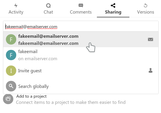
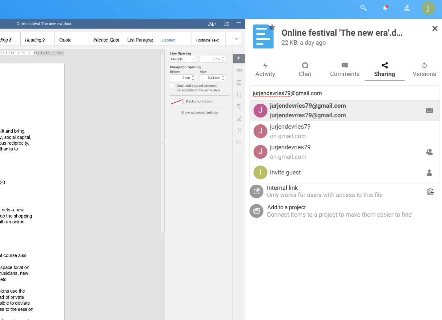
In the first, I know the second is federation, first is email, there's a icon. But perhaps we can still do better explaining things - like with a tooltip perhaps? Or a mouse-over effect?
In the 2nd screenshot, the mess is a bit worse - I don't even understand myself what the 3rd is...
Does it make sense to instead of repeating what the user typed, say something like
- send an email
(email address) - share to other server
(username on servername) - invite to guest account
(email address)
??? @nextcloud/designers
Contributor guide
First steps
- Read the whole issue, then the project's contributing guide.
- Comment on the issue to say you are picking it up — it saves two people doing the same work.
- Fork the repository and make your change on a branch.
- Open a pull request that references the issue number.
Research direction
Start with the issue screenshots and proposed labels for the sharing drop-down; no source file, test, or entry point is named. Done should make the email, federation, and guest-account choices understandable without relying on the user to interpret repeated input text.
Written by the indexing model from the issue text.
Assessment
- Tech stack
- javascript, php
- Domain
- design, frontend
- Issue type
- Feature
- Difficulty
- 4/5
- Estimated time
- 3-5 days
- Activity status
- Stale
- Clarity
- Needs clarification
- Newbie friendliness
- 35/100