Bad usability of "file is locked" message in upload
Nobody has claimed this yet.
- Dominant language
- PHP
- Stars
- 36.9k
- Forks
- 5.2k
- Avg merge
- 2d 3h
- Merged PRs (30d)
- 713
Description
Nextcloud version: (see Nextcloud admin page)
18.0.3
Updated from an older Nextcloud/ownCloud or fresh install:
Updated
I uploaded a directory with multiple subdirectories.
I received tens of notifications for locked files.
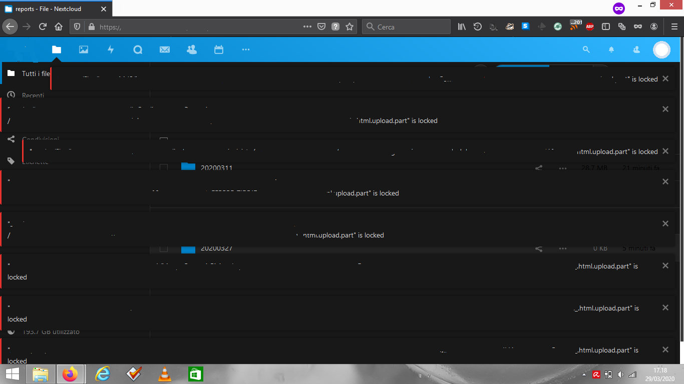
The notifications were correct, yet there are three problems:
-
the notifications were misaligned on the left, you can notice it by looking at the red vertical stripes. So a little bug in the interface
-
I had to dismiss all the notifications by hand, and I said there were tens of them. I think that a "x files locked" message would be better
-
I did not have any practical mean to save the list of files with problems for a successive check. A way of saving all the notifications in a file/note/whatever... would allow the user to review easily each problem afterwards
Contributor guide
First steps
- Read the whole issue, then the project's contributing guide.
- Comment on the issue to say you are picking it up — it saves two people doing the same work.
- Fork the repository and make your change on a branch.
- Open a pull request that references the issue number.
Research direction
No files, tests, or entry points are named. Start by locating the upload lock notification UI and its dismissal behavior; done means correcting the alignment and agreeing on an actionable way to group or preserve multiple locked-file notifications.
Written by the indexing model from the issue text.
Assessment
- Tech stack
- javascript, php
- Domain
- design, frontend
- Issue type
- Feature
- Difficulty
- 4/5
- Estimated time
- 3-5 days
- Activity status
- Stale
- Clarity
- Mostly clear
- Newbie friendliness
- 35/100