LDAP admin settings design improvements
Nobody has claimed this yet.
- Dominant language
- PHP
- Stars
- 36.9k
- Forks
- 5.2k
- Avg merge
- 2d 3h
- Merged PRs (30d)
- 713
Description
@nextcloud/ldap something for you! :) Quick tips on how to improve the LDAP app interface:
-
The
ui-…classes from the buttons override Nextcloud styles and should be removed :) -
The
<span class="ui-button-text">…</span>element around the text is unnecessary and can be removed too (the "Detect Port" button is standard style and clearly looks like a button)
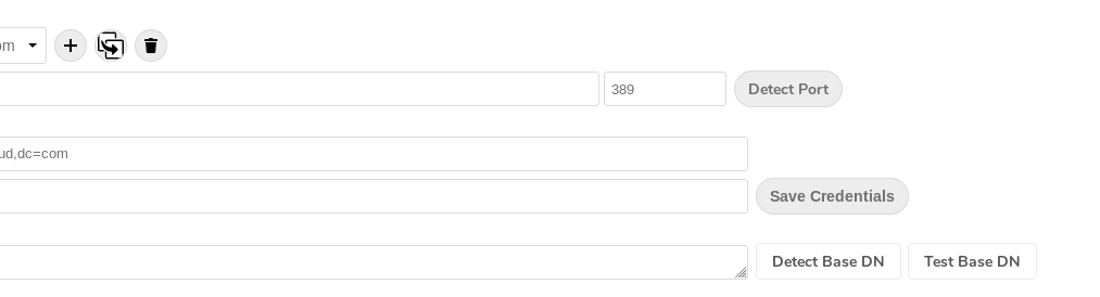
-
The "Configuration OK" element can be moved to be left-aligned
-
Same with the "Continue" and help elements, it can go below that and left-aligned. At the moment it’s floating weirdly in space.
Contributor guide
First steps
- Read the whole issue, then the project's contributing guide.
- Comment on the issue to say you are picking it up — it saves two people doing the same work.
- Fork the repository and make your change on a branch.
- Open a pull request that references the issue number.
Research direction
The issue does not name files or tests. Start by locating the LDAP app's admin settings UI and the markup for its buttons, status, Continue, and help elements. Compare the current layout with the attached screenshot; done means the listed class, wrapper, alignment, and positioning changes are reflected consistently.
Written by the indexing model from the issue text.
Assessment
- Tech stack
- css, javascript
- Domain
- authentication, frontend
- Issue type
- Refactor
- Difficulty
- 3/5
- Estimated time
- 1-2 days
- Activity status
- Stale
- Clarity
- Mostly clear
- Newbie friendliness
- 35/100