Improve experience of multiselecting mails
Nobody has claimed this yet.
- Dominant language
- JavaScript
- Stars
- 1k
- Forks
- 348
- Avg merge
- 12h 28m
- Merged PRs (30d)
- 91
Description
Is your feature request related to a problem? Please describe.
Currently the option to select a message is buried inside the action menu and the actions that you do can do after selecting are also mostly inside another action menu. This makes the experience of working multiple mails not discoverable and tedious.
Describe the solution you'd like
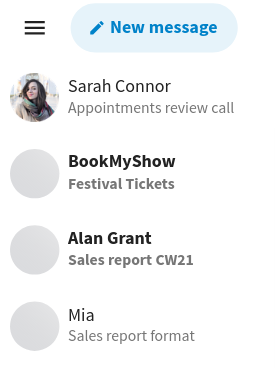
@jancborchardt and I looked through other solutions for multiselecting items and a common interaction is to show the multiselect upon hovering (Outlook, Protonmail, while other platforms like Gmail just show the multiselect checkbox at all times).
We could also do something similar, where
- The multiselect checkbox appears on hover (similar to the 3-dot menu).
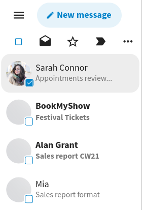
- The email would be selected when you click on the avatar.
- Once the email has been selected, as usual the rest of the messages get an empty checkbox to select, and the select/unselect all switch and multiselect actions appear on top.
- The selected messages also have rounded corners in the background
- The 3 most common actions are shown: Mark as read/unread, favourite, and mark as important. The rest of the actions are inside the 3 dot menu
| Unselected | Hovered | Selected |
|---|---|---|
 |
 |
 |
Describe alternatives you've considered
No response
Additional context
- Since using hover as an interaction won't work on mobile, we could also show the "Select" option in the action menu for each email in mobile. We could use the 2-level action menu that @jancborchardt had propsed in #5956 and have "Select" in "More actions".
- These mockups have the "New message" button in the list and not navigation, which creates space for some of the actions like the select all switch
(Edit: changed the background of the checkbox from white to current background colour)
Contributor guide
First steps
- Read the whole issue, then the project's contributing guide.
- Comment on the issue to say you are picking it up — it saves two people doing the same work.
- Fork the repository and make your change on a branch.
- Open a pull request that references the issue number.
Research direction
No source files, tests, or entry points are identified in the issue, so start by locating the mail list and message action-menu components in the frontend. Compare desktop hover behavior with the mobile action-menu path, then verify that selection controls, bulk actions, common actions, and selected-row styling match the described interaction.
Written by the indexing model from the issue text.
Assessment
- Tech stack
- javascript
- Domain
- design, frontend
- Issue type
- Feature
- Difficulty
- 4/5
- Estimated time
- 3-5 days
- Activity status
- Stale
- Clarity
- Mostly clear
- Newbie friendliness
- 35/100