Three- dot menus for envelope and message are not offering the same options
Open
Nobody has claimed this yet.
1. to develop
design
enhancement
nextcloud-gmbh
- Dominant language
- JavaScript
- Stars
- 1k
- Forks
- 348
- Avg merge
- 12h 28m
- Merged PRs (30d)
- 91
Description
Is your feature request related to a problem? Please describe.
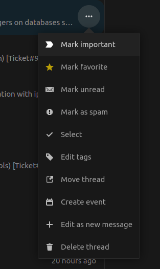
vs
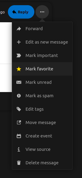
Describe the solution you'd like
The actions in the menus are (almost) identical, excluding the "View Source" Action.
Describe alternatives you've considered
No response
Additional context
There is some discussion about the menu actions in general as they're overcrowded here:
Contributor guide
First steps
- Read the whole issue, then the project's contributing guide.
- Comment on the issue to say you are picking it up — it saves two people doing the same work.
- Fork the repository and make your change on a branch.
- Open a pull request that references the issue number.
Research direction
Start by comparing the envelope and message three-dot menus shown in the issue screenshots, then read the related discussion in issue #5956. Identify the existing actions in each menu and align them, keeping "View Source" as the stated exception. Done means both menus offer the same actions apart from that exception.
Written by the indexing model from the issue text.
Assessment
- Tech stack
- javascript
- Domain
- frontend
- Issue type
- Feature
- Difficulty
- 3/5
- Estimated time
- 1-2 days
- Activity status
- Stale
- Clarity
- Mostly clear
- Newbie friendliness
- 45/100