Mail userbubble actions uses non-standard layout
Open
Nobody has claimed this yet.
1. to develop
design
enhancement
- Dominant language
- JavaScript
- Stars
- 1k
- Forks
- 348
- Avg merge
- 12h 28m
- Merged PRs (30d)
- 91
Description
The action shown when clicking on a recipient/sender userbubble are quite good! Currently they use a custom wide layout:
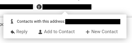
It would be even nicer if they just use the standard Actions component which shows them in a vertical list:
- Reply
- Contacts with this address: … (use avatar as action icon if possible)
- Add to contact
- New contact
Contributor guide
First steps
- Read the whole issue, then the project's contributing guide.
- Comment on the issue to say you are picking it up — it saves two people doing the same work.
- Fork the repository and make your change on a branch.
- Open a pull request that references the issue number.
Research direction
Start from the mail userbubble actions and compare their current custom wide layout with the standard Actions component mentioned in the issue. Reproduce the recipient or sender userbubble menu, then verify that it displays a vertical list with Reply, contact actions, Add to contact, and New contact.
Written by the indexing model from the issue text.
Assessment
- Tech stack
- javascript
- Domain
- design, frontend
- Issue type
- Feature
- Difficulty
- 3/5
- Estimated time
- 1-2 days
- Activity status
- Stale
- Clarity
- Mostly clear
- Newbie friendliness
- 45/100