Little change in a label of UI
Nobody has claimed this yet.
- Dominant language
- Swift
- Stars
- 2.5k
- Forks
- 1k
- Avg merge
- 2d 18h
- Merged PRs (30d)
- 13
Description
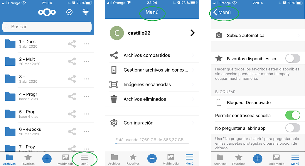
I would like to talk about the "More" button located at the bottom-right of the UI.
Expected behaviour
I suggest change the button label from "More" to "Menu"
Actual behaviour
Button label is "More"
When we press that button, a side panel (iPad) or a fullscreen list (iOS) with various items is displayed.
At the top of the screen, "More" is displayed when it is clearly a list of items, same as a menu.
When you go into an item and want to go back, the back buttom shows "More", I think it's better to go back to "Menu"
Steps to reproduce
Navigate across UI
Reasoning or why should it be changed/implemented?
I think "Menu" explain better what is inside that button, and, when we navigate and go back, it is better going back to "Menu" instead going back to "More"
That is a little screenshots I made to show up my suggestion:
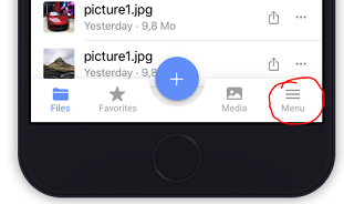
On the other hand I have seen that in https://github.com/nextcloud/ios/issues/1218 a similar topic is already being discussed and in the screenshots I see that this button has been renamed to "Menu"
.
.
.
iOS version
13.1.4
App version
2.25.9.2
Server configuration
Nextcloud version: v18.0.4
Contributor guide
First steps
- Read the whole issue, then the project's contributing guide.
- Comment on the issue to say you are picking it up — it saves two people doing the same work.
- Fork the repository and make your change on a branch.
- Open a pull request that references the issue number.
Research direction
Search the iOS UI for the existing “More” label and review related issue #1218 and its screenshots. Confirm the affected navigation contexts, with the side panel and fullscreen list in scope, and consider the change complete when the relevant button and back label consistently display “Menu”.
Written by the indexing model from the issue text.
Assessment
- Tech stack
- swift
- Domain
- design, mobile
- Issue type
- Feature
- Difficulty
- 2/5
- Estimated time
- 1-3 hours
- Activity status
- Stale
- Clarity
- Mostly clear
- Newbie friendliness
- 48/100