Improved relationships UI - Less visual clutter needed
Nobody has claimed this yet.
- Dominant language
- JavaScript
- Stars
- 1.4k
- Forks
- 354
- Avg merge
- 1d 10h
- Merged PRs (30d)
- 43
Description
Describe the solution you'd like
This is more of a topic for discussion. I find that the current UI fine if you have only a single relationship, but once you start adding many relationships, it gets to be a lot of visual clutter.
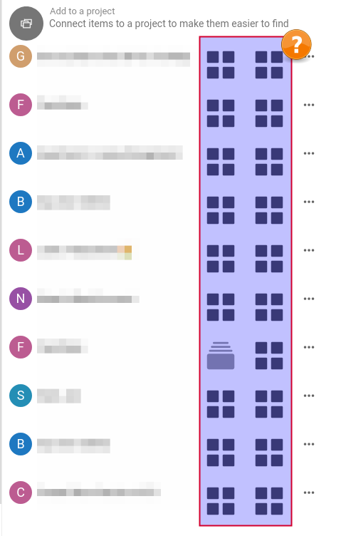
For example, look at the list of relationships in the attached screen.
Is it really necessary to show both of the relationships (the user is already in context)? I should be able to just click on the link and go.
I think this would simplify the mobile app as well because when you click on one of those line a menu comes up. It's unnecessary IMHO.
Any thoughts on this? Maybe it's already being discussed somewhere?
Contributor guide
First steps
- Read the whole issue, then the project's contributing guide.
- Comment on the issue to say you are picking it up — it saves two people doing the same work.
- Fork the repository and make your change on a branch.
- Open a pull request that references the issue number.
Research direction
Start by reviewing the attached screenshot and the current relationships list in the Deck UI, then read the existing three-comment discussion for context. The issue does not name files, tests, or an entry point, and it remains a design discussion; done would require an agreed approach that reduces visual clutter and addresses the mobile interaction.
Written by the indexing model from the issue text.
Assessment
- Tech stack
- javascript
- Domain
- frontend
- Issue type
- Feature
- Difficulty
- 5/5
- Estimated time
- Over a week
- Activity status
- Stale
- Clarity
- Needs clarification
- Newbie friendliness
- 25/100