nextcloud-libraries / nextcloud-libraries/nextcloud-vue
App content list item layout detail
Nobody has claimed this yet.
- Dominant language
- Vue
- Stars
- 246
- Forks
- 99
- Avg merge
- 1d 20h
- Merged PRs (30d)
- 103
Description
This is the current message list component, or at least how it appears in Mail – and in Talk it is similar (or at least 1 similar issue occurs, as explained below):
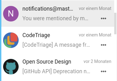
One issue is that ellipsizing of the text in the subline starts too early. The subline has a margin-right from the icon, which is not needed for the subline if there is an action menu, as the menu icon has enough padding to provide space from the text:
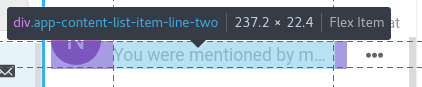
Issue two is that the menu button is actually not all the way on the right side of the list item but rather has a 7px distance. Which results in some more space wasted for the subline, as well as the unintended effect that if you click too far right of the icon, actually the item opens, and not the menu (this also happens in Talk):

This is of course because there is a padding around the whole entry:
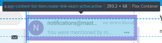
Proposal
- Remove padding-right from the whole entry
- Add padding-right: 7px; to the date in the top right
- Remove padding-right from the subline
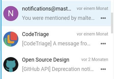
You can already see that even though it’s a tiny change only, the action icon looks much nicer aligned, there’s some more space for the text, and the menu click issue is fixed:
cc @skjnldsv @ma12-co @ChristophWurst @juliushaertl – I guessed this belongs in the components repo. Feel free to move or open issues in other repos as appropriate.
Contributor guide
First steps
- Read the whole issue, then the project's contributing guide.
- Comment on the issue to say you are picking it up — it saves two people doing the same work.
- Fork the repository and make your change on a branch.
- Open a pull request that references the issue number.
Research direction
Start from the current message list component in the Vue implementation and compare its spacing with the screenshots in the issue. Check the three proposed right-padding changes, then verify that the menu aligns with the item edge, the subline has more room, and clicks in the menu area open the menu rather than the item.
Written by the indexing model from the issue text.
Assessment
- Tech stack
- javascript
- Domain
- frontend
- Issue type
- Bug
- Difficulty
- 2/5
- Estimated time
- 1-3 hours
- Activity status
- Stale
- Clarity
- Mostly clear
- Newbie friendliness
- 35/100