musescore / musescore/MuseScore
Inconsistency in some dialogs shape (style)
Open
Nobody has claimed this yet.
P3
UI
- Dominant language
- C++
- Stars
- 15.1k
- Forks
- 3.3k
- Avg merge
- 2d 2h
- Merged PRs (30d)
- 91
Description
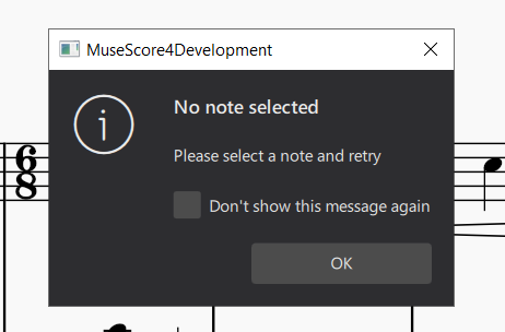
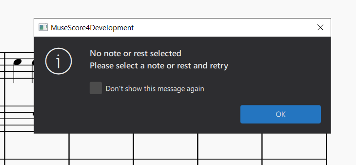
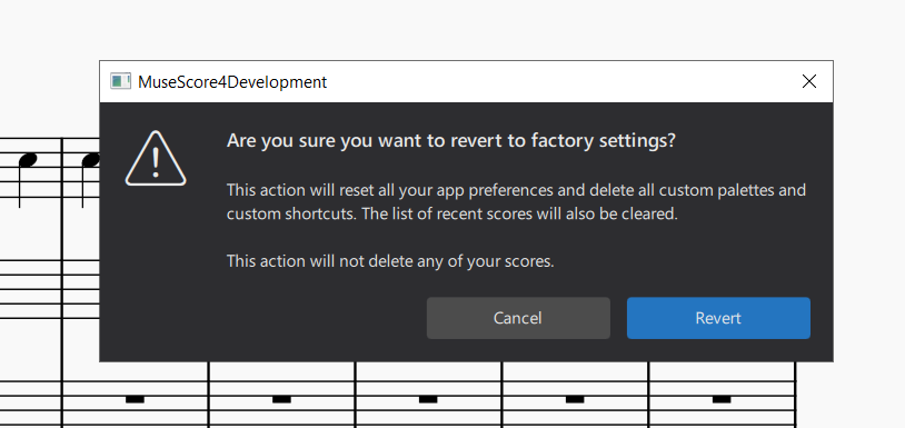
- This looks like too tight comparing with 2 and 3
- The second string is bold here comparing with 1
Platform information
macOS, Windows, Linux
Additional content
The 1st dialog was enabled after #15366
Contributor guide
First steps
- Read the whole issue, then the project's contributing guide.
- Comment on the issue to say you are picking it up — it saves two people doing the same work.
- Fork the repository and make your change on a branch.
- Open a pull request that references the issue number.
Research direction
No source files or tests are identified. Start by locating the three dialogs represented by the attached screenshots in the desktop UI and compare their spacing and text weight; done means the dialogs share consistent shape and typography across macOS, Windows, and Linux.
Written by the indexing model from the issue text.
Assessment
- Domain
- design, desktop
- Issue type
- Bug
- Difficulty
- 3/5
- Estimated time
- 1-2 days
- Activity status
- Stale
- Clarity
- Needs clarification
- Newbie friendliness
- 25/100