[Grid] Inconsistent layouts between Chrome and Safari
Nobody has claimed this yet.
- Dominant language
- JavaScript
- Stars
- 99.1k
- Forks
- 32.5k
- Avg merge
- 2d 17h
- Merged PRs (30d)
- 106
Description
Duplicates
- I have searched the existing issues
Latest version
- I have tested the latest version
Current behavior 😯
Hey, I was playing with Grid in an existing project and I noticed some inconsistent behaviour between Chrome and Safari when nesting Grid containers.
<Grid container direction="row">
	<Grid item>
		<Grid container direction="column">
			<Grid item>1</Grid>
			<Grid item>2</Grid>
		</Grid>
	</Grid>
	<Grid item>
		<Grid container direction="column">
			<Grid item>3</Grid>
			<Grid item>4</Grid>
		</Grid>
	</Grid>
</Grid>
The result of the above snippet is identical in both Chrome and Safari.
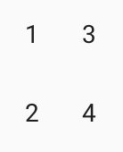
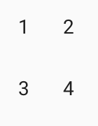
But if revert the directions of the containers from row to column and from column to row, the layout is not the same in Chrome and Safari anymore. There is a much bigger spacing in Safari between the rows in Safari.
<Grid container direction="column">
	<Grid item>
		<Grid container direction="row">
			<Grid item>1</Grid>
			<Grid item>2</Grid>
		</Grid>
	</Grid>
	<Grid item>
		<Grid container direction="row">
			<Grid item>3</Grid>
			<Grid item>4</Grid>
		</Grid>
	</Grid>
</Grid>
And here are the results:
Chrome
Safari
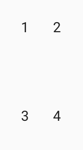
If I add a nowrap to the outermost container the result becomes the same on both Chrome and Safari. But none of the elements is overflowing so I don't think there should be need of that nowrap attribute
<Grid container direction="column" wrap="nowrap">
	<Grid item>
		<Grid container direction="row">
			<Grid item>1</Grid>
			<Grid item>2</Grid>
		</Grid>
	</Grid>
	<Grid item>
		<Grid container direction="row">
			<Grid item>3</Grid>
			<Grid item>4</Grid>
		</Grid>
	</Grid>
</Grid>
Expected behavior 🤔
I would expect a consistent layout in both Chrome and Safari when nesting Grid container. The behaviour in Chrome looks more correct than in Safari
Steps to reproduce 🕹
<Grid container direction="column">
	<Grid item>
		<Grid container direction="row">
			<Grid item>1</Grid>
			<Grid item>2</Grid>
		</Grid>
	</Grid>
	<Grid item>
		<Grid container direction="row">
			<Grid item>3</Grid>
			<Grid item>4</Grid>
		</Grid>
	</Grid>
</Grid>
Context 🔦
No response
Your environment 🌎
@material-ui/core v4.12.3
Contributor guide
First steps
- Read the whole issue, then the project's contributing guide.
- Comment on the issue to say you are picking it up — it saves two people doing the same work.
- Fork the repository and make your change on a branch.
- Open a pull request that references the issue number.
Research direction
Start by reproducing the nested Grid example from the issue in @material-ui/core v4.12.3, comparing the column layout in Chrome and Safari. Investigate the Grid container and wrapping behavior, including the reported effect of wrap="nowrap". Done means nested containers produce consistent spacing without requiring nowrap, with the reproduction checked in both browsers.
Written by the indexing model from the issue text.
Assessment
- Tech stack
- javascript, react
- Domain
- frontend
- Issue type
- Bug
- Difficulty
- 4/5
- Estimated time
- 3-5 days
- Activity status
- Stale
- Clarity
- Mostly clear
- Newbie friendliness
- 35/100