[chip] Labels have insufficient color contrast when 'outlined' and 'color' variants applied
Nobody has claimed this yet.
- Dominant language
- JavaScript
- Stars
- 99.1k
- Forks
- 32.5k
- Avg merge
- 2d 17h
- Merged PRs (30d)
- 106
Description
Current behavior 😯
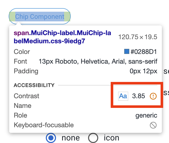
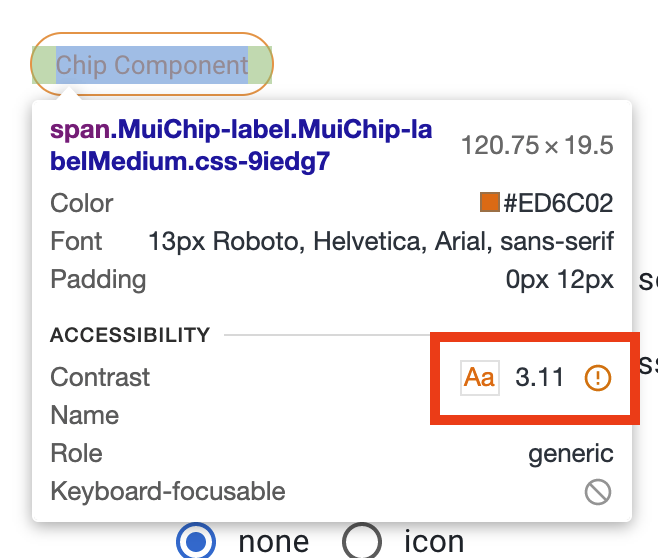
In light mode, in the Chip playground when variant is set to 'outlined' and color is set to 'info' or 'warning', the contrast ratio is 3.85:1 and 3.11:1, respectively, which doesn't pass the WCAG 2 AA contrast ratio threshold of 4.5:1
Expected behavior 🤔
According to WCAG docs:
Success Criterion: Ensure color contrast of at least 4.5:1 for small text or 3:1 for large text, even if text is part of an image. Large text has been defined in the requirements as 18pt (24 CSS pixels) or 14pt bold (19 CSS pixels). Note: Elements found to have a 1:1 ratio are considered "incomplete" and require a manual review.
This only happens for info and warning. So, the update could be isolated to these two use cases where we use .dark instead of .main when setting the color of the Chip.
Or, this could be a larger conversation about possibly adding some logic similar to how we set the color of the Alert component at the theme level so any time a component uses "theme palette colors" for "text" it is more likely to be 1. consistent, and 2. more likely to have a contrast ration threshold of 4.5:1
Steps to reproduce 🕹
In the [Chip playground], in Chrome, set variation to 'outlined' and color to 'info' or 'warning'. Open dev console and hover the Chip element. You'll notice the built in accessibility checker confirms the contrast ratio is below the WCAG AA expected standard.
Context 🔦
This was discovered while developing a component within our own design system which sits on top of MUI.
We're using the MUI Figma resource to style our components first and the color for this given component's text was set to the "Error/Alert/Content" value. Looking into it, that is the color used for the Alert component when variant is 'outlined' and color is 'error'. Looking for other examples of this, I came across Chip and realized it wasn't using the same logic as Alert and although most of the colors being used still pass the contrast ratio threshold, "info" and "warning" do not.
Your environment 🌎
This can be reproduced in Chrome, using MUI docs site. No need for environment info.
Contributor guide
First steps
- Read the whole issue, then the project's contributing guide.
- Comment on the issue to say you are picking it up — it saves two people doing the same work.
- Fork the repository and make your change on a branch.
- Open a pull request that references the issue number.
Research direction
Start in packages/mui-material/src/Chip/Chip.js at the color-setting logic referenced by the issue, then compare the theme-level behavior in packages/mui-material/src/Alert/Alert.js. Reproduce the outlined info and warning cases in the Chip playground and verify that the resulting text contrast meets the WCAG AA 4.5:1 threshold. Done means both affected variants have accessible contrast without losing the intended component behavior.
Written by the indexing model from the issue text.
Assessment
- Tech stack
- javascript, react
- Domain
- accessibility, frontend
- Issue type
- Bug
- Difficulty
- 4/5
- Estimated time
- 3-5 days
- Activity status
- Stale
- Clarity
- Mostly clear
- Newbie friendliness
- 35/100